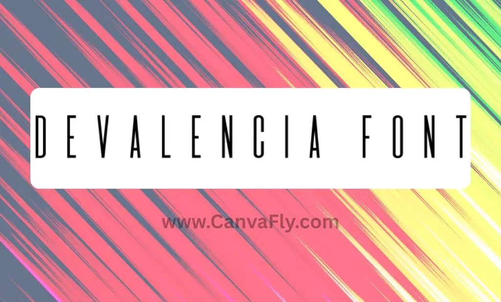
Devalencia Font: The Minimalist Typeface Shaping Modern Brand Identities
Looking for a font that strikes the perfect balance between modern minimalism and sophisticated elegance? The Devalencia font might be exactly what your next design project needs. This monospaced display typeface has quietly emerged as a designer favorite for brands wanting to make a statement without saying too much.
Table of Contents
What Makes Devalencia Font Special?
The Devalencia font isn’t just another sans-serif typeface cluttering your design toolkit. Originally crafted for the Mexican short film A solas, this distinctive Devalencia font brings something genuinely unique to the table. Its tall, narrow letters create an immediate visual impact, while the monospaced structure ensures consistency across all your applications.
What really sets Devalencia Regular apart is its impressive versatility. Designer Manuel Fernández del Campo García developed it with dual functionality in mind – use wide kerning for bold, attention-grabbing titles or tighten the spacing for dense blocks of text like film credits. This adaptability makes it a practical choice for both statement headlines and readable body copy.
Design Characteristics That Define Devalencia
If you’re considering adding Devalencia to your font collection, here’s what you should know about its key design elements:
- Geometric precision: The letterforms follow clean, mathematical principles
- Minimalist approach: No decorative serifs or unnecessary flourishes
- Uniform spacing: The monospaced structure creates rhythmic visual flow
- Low contrast strokes: Consistent line weight enhances readability
- Elongated uppercase: Provides sophisticated vertical emphasis
These characteristics combine to create a typeface that feels simultaneously technical and elegant – perfect for brands wanting to project modernity without sacrificing sophistication.
How Devalencia Compares to Similar Fonts
Wondering how Devalencia stacks up against other condensed or narrow fonts? Here’s a quick comparison with some alternatives:
| Font Name | Style | Best Use Cases | Distinctive Features |
|---|---|---|---|
| Devalencia | Monospaced Display | Logos, Headlines, Film Credits | Adjustable kerning, minimalist elegance |
| Valencia | Condensed Sans-Serif | Dynamic Hierarchies, Posters | Five weights with obliques, low horizontal crossbars |
| Valencia Calligraphic | Handwritten | Artisanal Brands, Wedding Materials | Fluid strokes, organic warmth |
| Terrain | Condensed with Imperfections | Eco-Friendly Brands, Organic Products | Hand-drawn textures, sustainability vibe |
| Kionsa | Ultra-Condensed | Youth-Oriented Campaigns, Tech Brands | Italicized variants for motion |
While fonts like Valencia offer more weight variations, Devalencia excels in scenarios where precision and consistency are paramount. Its monospaced structure ensures it renders reliably across digital and print media – a crucial consideration for cross-platform brand identity.
The Psychology Behind Devalencia’s Appeal
Fonts speak volumes before we even process the words they form. Devalencia’s clean, geometric structure subconsciously communicates precision, reliability, and forward-thinking – qualities particularly valued in industries like:
- Technology and fintech
- Contemporary architecture
- Luxury minimalist fashion
- Premium product packaging
- Modern film and entertainment
The font’s hybrid identity – monospaced yet minimalist – bridges traditional associations of trustworthiness with contemporary relevance. This makes it particularly effective for brands undergoing repositioning or those wanting to balance heritage with innovation.
Strategic Applications of Devalencia in Branding
Smart designers know that typography isn’t just about aesthetics – it’s a strategic tool for brand positioning. Here’s how you can leverage Devalencia’s unique characteristics:
Visual Hierarchy Through Kerning
Take a page from A solas‘ approach by using Devalencia’s flexible kerning to create contrast between different text elements. A product packaging design might use wide kerning for the brand name (conveying exclusive elegance) while using tighter spacing for ingredient lists or technical specifications (emphasizing precision).
Cross-Platform Consistency
The Devalencia font’s monospaced design ensures exceptional legibility across devices – from billboard-sized applications down to mobile screens. This makes it an excellent choice for digital-first brands where typography needs to perform consistently across multiple touchpoints.
Balancing Trend and Timelessness
While ultra-condensed fonts like Kionsa might be trendy, they risk becoming dated quickly. Devalencia’s minimalist foundation gives it staying power more akin to classics like Helvetica or Futura. This makes it suitable for core brand assets where longevity matters.
Practical Considerations When Using Devalencia
Before implementing Devalencia in your next design project, keep these practical factors in mind:
Licensing and Usage Rights
Good news for budget-conscious designers: Devalencia features an open license allowing free commercial use. This accessibility makes it particularly attractive for startups and independent projects where font licensing costs can add up quickly.
Cultural Context and Global Appeal
Originally developed for a Mexican film, Devalencia carries subtle regional aesthetics that may resonate differently across global markets. However, its clean, geometric design generally translates well across cultures, making it suitable for international brands.
Technical Performance
As with any font, test Devalencia thoroughly before implementation. While its monospaced structure generally ensures good readability, very small sizes may impact legibility. Always check how it renders across different browsers and devices.
The Future of Devalencia Font and Similar Typography
Typography continues to evolve with technology, and fonts like the Devalencia font are poised to adapt in exciting ways:
Variable Font Possibilities
Imagine Devalencia evolving from condensed to extended styles based on user interaction – a capability made possible by emerging variable font technology. This could enable responsive typography that dynamically adjusts to viewing context.
AI-Driven Typography
Machine learning algorithms now enable personalized typography experiences. Brands might deploy Devalencia differently based on user demographics or behavior, creating tailored visual experiences while maintaining core identity elements.
Conclusion: Why Devalencia Font Deserves a Place in Your Font Library
The Devalencia font’s journey from film credits to versatile brand asset highlights its exceptional design value. Its monospaced structure, minimalist elegance, and remarkable adaptability make it an excellent choice for designers seeking to balance modernity with sophistication.
Whether you’re developing a tech startup’s visual identity or refreshing an established brand’s typography, the Devalencia font offers that rare combination of distinctive character and practical functionality. The font speaks clearly without shouting – a quality increasingly valuable in today’s visually saturated landscape.
Ready to experiment with the Devalencia font in your next design project? Download the Devalencia font and discover how its tall, narrow letterforms might elevate your visual communication.