Stencil Fonts: Bold Typography That Commands Attention
You know that feeling when you spot perfect typography that just hits different? Stencil fonts are the secret weapon behind some of the most memorable brand identities you see daily. From military-grade packaging to street art that stops you mid-scroll, these broken-letter beauties pack more punch than your morning espresso.
Whether you’re designing the next big streetwear brand or need that industrial edge for your client’s construction company, this typography style isn’t just trendy – it’s a timeless workhorse that delivers serious visual impact. Let’s dive into why these cut-out characters deserve a spot in your design arsenal.
Table of Contents
What Are Stencil Fonts (And Why They’re Design Gold)
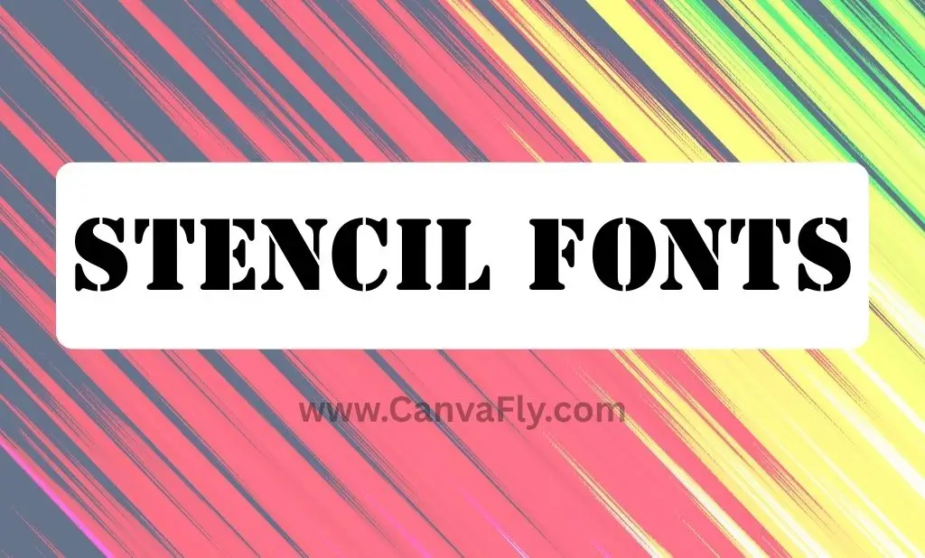
Stencil fonts are typefaces designed to mimic the appearance of letters created with physical stencils – you know, those templates with cut-out shapes that let paint bleed through. The result? Letters that look deliberately broken or sliced, creating gaps that give them their signature industrial aesthetic.
Think of this typography style as the design equivalent of distressed jeans. They’re intentionally imperfect, and that’s exactly what makes them perfect. These fonts typically feature bold, graphic strokes that command attention from across a crowded room (or cluttered Instagram feed). Unlike groovy font styles that flow with organic curves, stencil lettering creates sharp, utilitarian impact through strategic breaks.
The magic happens in those strategic breaks. Where traditional fonts flow seamlessly, this typography style creates visual tension through negative space. It’s like the design world’s version of strategic pauses in conversation – sometimes what you don’t say (or don’t connect) speaks volumes.
The Psychology Behind Stencil Typography
Here’s where it gets interesting. Stencil fonts tap into our psychological associations with utility, authenticity, and strength. When you see stencil lettering, your brain immediately connects it to:
- Military precision and reliability
- Industrial craftsmanship and durability
- Street art rebellion and authenticity
- Utilitarian function over form
This isn’t just design theory – it’s behavioral psychology in action. Brands leveraging this typography style strategically position themselves as trustworthy, no-nonsense players in their industries.
Contemporary Stencil Font Trends That Actually Matter
The stencil typography game has evolved way beyond basic military lettering. Today’s designers are pushing boundaries with styles that range from minimalist elegance to bold sporting aesthetics.
Refined Stencil Styles are having a moment. Take fonts like Quizles – it’s a serif stencil font with elegant, fading thin lines that proves stencil doesn’t always mean harsh. Perfect for brands wanting that industrial edge without the rough-around-the-edges vibe.
On the flip side, Bold Athletic Stencils like Grow Bones bring dynamic shapes and sporty energy. These fonts work magic for fitness brands, sports teams, or any company wanting to project strength and movement.
The trend we’re seeing? This typography style is shedding its purely utilitarian image. Modern variations play with contrast, mixing delicate elements with traditional stencil breaks. It’s sophistication meets street smarts – exactly what today’s brands need. This evolution parallels how y2k fonts brought retro-futurism to contemporary design, but stencil typography focuses on industrial authenticity rather than digital nostalgia.
According to Design Work Life, contemporary stencil fonts like Towards offer “minimalist stencil font with a clean, sans-serif design” that proves stencil typography can be both elegant and impactful.
Digital-First Stencil Design
Unlike traditional stencil fonts that were constrained by physical cutting limitations, digital versions can push creative boundaries. Designers now create stencil effects that would be impossible to cut by hand, opening up possibilities for more complex and nuanced typography.
Strategic Brand Applications: Where This Typography Dominates
Smart brand owners and marketers don’t just throw stencil fonts around randomly. They deploy them strategically, understanding exactly where these fonts deliver maximum impact.
Brand Positioning and Personality
Stencil fonts are personality powerhouses. They project reliability, strength, and authenticity – making them go-to choices for industries like construction, outdoor gear, fitness, automotive, and craft brewing. When a craft beer company uses stencil lettering, they’re not just displaying their name; they’re communicating their artisanal approach and no-frills quality focus.
Packaging That Pops
Ever notice how army stencil font styles dominate products targeting masculine or artisanal markets? Tools, camping gear, specialty foods – they all leverage this typography to communicate durability and quality. The broken letters subconsciously suggest the product inside can handle whatever you throw at it.
Apparel and Merchandise Mastery
This typography style owns the streetwear and outdoor apparel game. Bold presence ensures brand visibility whether it’s screen-printed on t-shirts or embroidered on caps. The industrial aesthetic resonates with consumers who value authenticity over polish. While chicano font styles bring cultural heritage to apparel design, stencil lettering delivers universal industrial appeal that transcends specific communities.
For designers seeking versatility, Adobe Fonts offers professional stencil options that integrate seamlessly with design workflows, ensuring consistent quality across all brand touchpoints.
Creative Marketing Applications Beyond the Obvious
Here’s where stencil fonts get really interesting – in guerrilla marketing and cost-effective branding strategies.
Laser-Cut Stencil Marketing
Progressive brands use laser-cut stencils for large-scale branding on walls and floors in high-traffic areas. It’s guerrilla marketing gold – surprising audiences with fresh, low-cost techniques that create memorable brand encounters. The stencil aesthetic reinforces the grassroots, authentic feel of the marketing approach.
Editorial Impact
Magazine designers and digital media creators leverage this typography for impactful headlines, especially when covering industrial topics, technology, or urban culture. The typography choice reinforces the content’s edge and authenticity. According to Smashing Magazine’s typography guidelines, successful editorial typography requires matching font personality with content tone – something stencil lettering excels at for edgy, authoritative content.
Unlike decorative options like Happy Birthday Fonts designed for celebration, stencil fonts communicate seriousness and reliability in editorial contexts.
| Application | Best Use Case | Impact Level |
|---|---|---|
| Headlines | Industrial/Tech content | High |
| Packaging | Masculine/Artisanal products | Very High |
| Apparel | Streetwear/Outdoor brands | High |
| Signage | Guerrilla marketing | Very High |
Design Best Practices: Using Stencil Typography Like a Pro
Want to harness stencil typography power without looking amateur? Here are the non-negotiable rules every designer should follow.
Typography Hierarchy Fundamentals
Never, ever use stencil fonts for body text. They’re attention magnets, which means they’re distracting when you need sustained reading. Reserve them for headlines, logos, and short impactful statements where you want maximum visual punch.
Font Pairing That Actually Works
The secret sauce? Contrast. Pair your bold stencil headline with clean serif or sans-serif body text. This creates natural hierarchy while letting each font type do what it does best. Your stencil typography grabs attention; your body font maintains readability.
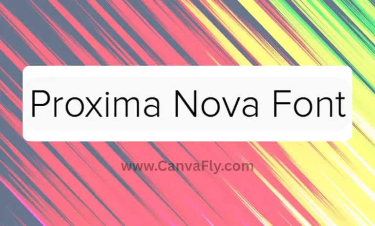
For professional applications, consider pairing stencil headlines with established fonts like Proxima Nova font for body text – the clean, modern sans-serif provides perfect contrast to stencil’s industrial edge. This approach follows Smashing Magazine’s typography principles for effective font pairing and hierarchy.
Whitespace Is Your Friend
Stencil fonts are visually dense by nature. They need breathing room to maintain their impact without overwhelming the design. Use generous whitespace to let the typography shine and maintain overall design balance.
Alignment with Brand Personality
This is crucial – your stencil font choice must align with your brand’s core message and target audience. A delicate, refined stencil works for luxury brands wanting an industrial edge. A bold, heavy stencil suits construction companies or fitness brands.
Finding the Perfect Stencil Font for Your Project
The stencil fonts landscape is vast, and knowing where to look makes all the difference. Professional designers understand that font selection is half strategy, half intuition.
Custom stencil lettering vs. Commercial Fonts
Sometimes your project demands something unique. Custom stencil lettering allows complete control over every cut and curve, ensuring your brand’s typography is truly one-of-a-kind. But for most projects, high-quality commercial options offer excellent value and immediate availability.
Evaluating Font Quality
Not all stencil fonts are created equal. Look for fonts with consistent stroke weights, well-planned stencil breaks that maintain legibility, and complete character sets including numbers and special characters. The breaks should feel intentional, not random.
Professional resources like Creative Bloq and Design Shack regularly curate high-quality stencil fonts, helping designers avoid amateur options that compromise project quality.
College font and Educational Applications
Interestingly, many educational institutions leverage stencil aesthetics for athletic branding and campus signage. The bold, authoritative feel of stencil typography reinforces institutional strength and tradition while maintaining modern appeal. This differs from playful choices like twitter fonts used for social media engagement, where stencil fonts communicate institutional gravitas.
Font Squirrel offers several high-quality, commercial-use stencil fonts perfect for educational applications, ensuring proper licensing for institutional use.
Advanced Stencil Font Techniques
Ready to level up your stencil font game? These advanced techniques separate amateur hour from professional polish.
Layering and Effects
Modern design software allows creative layering of stencil fonts with shadows, outlines, and textures. But remember – the power of stencil fonts lies in their simplicity. Enhance, don’t overwhelm.
Color Strategy
Stencil fonts work beautifully in monochrome, but strategic color use can amplify their impact. High contrast combinations (white on black, bright colors on neutral backgrounds) maintain the utilitarian aesthetic while adding contemporary flair.
Scale and Proportion
Stencil fonts scale beautifully – from massive wall graphics to small product labels. However, very small sizes can lose the stencil effect as breaks become invisible. Test your font at actual usage sizes during the design phase.
Industry-Specific Stencil Font Applications
Different industries leverage stencil fonts in unique ways, understanding their specific audience psychology and brand positioning needs.
Military and Defense Contractors
The army stencil font aesthetic isn’t just tradition – it communicates precision, reliability, and no-nonsense functionality. These organizations understand that their typography choice reinforces their operational excellence and dependability.
Craft and Artisanal Brands
Craft breweries, artisanal food producers, and handmade goods companies use stencil fonts to communicate authenticity and quality craftsmanship. The industrial aesthetic suggests products made with care and attention to detail.
Technology and Startups
Forward-thinking tech companies increasingly embrace stencil fonts to differentiate from the sea of clean, minimal sans-serif competitors. The industrial edge suggests innovation with substance – technology that actually works. This strategic typography choice helps tech brands avoid the generic feel that plagues many startups using similar freaky font choices just for attention.
Awwwards, the premier showcase of web design excellence, regularly features websites that use stencil typography effectively in tech and startup branding, proving its growing acceptance in digital spaces.
Common Stencil Font Mistakes (And How to Avoid Them)
Even experienced designers sometimes stumble with stencil fonts. Here are the pitfalls that’ll kill your design’s impact.
Overuse and Font Mixing
Using multiple stencil fonts in one design is almost always a mistake. These fonts are naturally dominant – using more than one creates visual chaos rather than hierarchy.
Inappropriate Context
Stencil fonts have strong personality associations. Using them for gentle, nurturing brands (like childcare or wellness) creates cognitive dissonance that confuses rather than communicates. Save romantic scripts like Lovely Fonts for intimate brands, and reserve stencil fonts for contexts that benefit from their industrial strength.
Typography experts at I Love Typography emphasize that successful font selection requires matching typeface personality with brand values – a principle that’s especially critical with distinctive fonts like stencils.
Poor Spacing and Kerning
The stencil breaks already create visual gaps – poor letter spacing compounds this, making text difficult to read. Pay extra attention to spacing and kerning when working with stencil fonts.
Future Trends in Stencil Typography
The stencil fonts evolution continues, driven by digital capabilities and changing design preferences.
Variable Font Technology
Variable stencil fonts allow designers to adjust the width and weight of stencil breaks dynamically. This technology enables more nuanced applications while maintaining the core stencil aesthetic.
Hybrid Styles
Expect more fonts that blend stencil elements with other typographic styles – combining the industrial edge of stencils with the elegance of script fonts or the friendliness of rounded sans-serifs.
Sustainable Design Aesthetics
As sustainability becomes central to brand identity, stencil fonts align perfectly with values of durability, functionality, and no-waste design philosophy.
Resource Recommendations for Stencil Font Exploration
Professional designers know that great typography requires great resources. Here’s where to find quality stencil fonts that’ll elevate your projects.
Professional Font Libraries
Invest in fonts from reputable foundries that provide complete licensing and ongoing support. Quality stencil fonts include extensive character sets, multiple weights, and professional spacing. Resources like 1001 Fonts offer both free and premium stencil options, though premium foundries typically provide superior craftsmanship and commercial licensing clarity.
Free vs. Premium Options
While free stencil fonts exist, premium options typically offer better craftsmanship, more complete character sets, and proper licensing for commercial use. Consider your project’s scope and budget when making this decision. Unlike specialized fonts like The Boys Font created for specific franchises, generic stencil fonts offer broader commercial applications and licensing flexibility.
Wrapping Up: Your Stencil Font Strategy
Stencil fonts aren’t just typography – they’re strategic brand tools that communicate strength, authenticity, and industrial precision. When used thoughtfully, they create memorable brand experiences that resonate with audiences seeking genuine, no-nonsense value.
The key is understanding your brand personality and audience expectations. Stencil fonts work magic for brands wanting to project reliability and strength, but they can backfire if misaligned with your core message.
Start experimenting with stencil fonts in your next project, but remember the golden rules: use them strategically, pair them wisely, and always prioritize readability alongside impact. Your designs will thank you, and more importantly, your clients will see results.
What’s your take on stencil fonts? Ready to add some industrial edge to your next design project?