Salliery Font: The Gothic Typeface That’s Making Brands Bold Again
You know that feeling when you spot something that just hits different? That’s exactly what happens when you encounter Salliery font in the wild. This isn’t your grandpa’s typeface gathering dust in some forgotten design folder—this is a bold blackletter font that’s making serious waves in contemporary design circles.
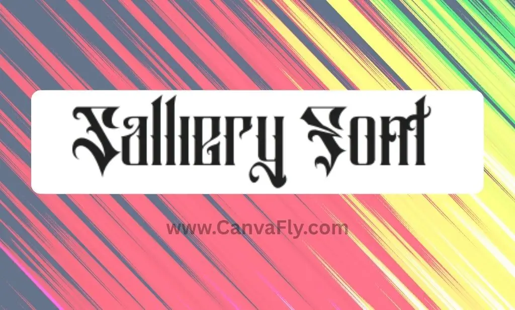
Created by the talented team at brightonexart, Salliery font belongs to the blackletter family (you might know it as Gothic or Old English), but it’s got that modern edge that makes it feel fresh rather than medieval. Think of it as the typography equivalent of a vintage leather jacket—classic roots with serious contemporary appeal.
Table of Contents
What Makes Salliery Font Your Secret Design Weapon
Salliery isn’t just another pretty typeface trying to catch your eye. This font comes loaded with carefully crafted details that make formal designs pop instantly. You’re getting the full package: lowercase, uppercase, numerals, punctuation, and accented character support that’ll handle whatever you throw at it.
Here’s where it gets interesting—Salliery rolls deep with multiple styles:
- Standard Character: Your go-to for that authentic blackletter punch
- Outline: When you want the drama without the heavy ink
- Italic: Because sometimes you need that extra swagger
The font’s authentic blackletter characteristics give it serious visual weight, making it perfect for brands that aren’t afraid to make a statement. It’s like having a typography wingman that never lets you blend into the crowd.
Why Salliery Font Stands Out in a Crowded Typography Market
Let’s be real—the font game is more competitive than dating apps these days. The global font and typeface market hit $8.2 billion in 2024 and is projected to reach $12.5 billion by 2033. That’s a lot of fonts fighting for attention.
But here’s where Salliery plays it smart. While everyone else is chasing the minimalist trend, this font zigs when others zag. It’s positioned perfectly for the luxury and heritage branding movement that’s gaining serious momentum.
The psychology behind it is fascinating. Typography functions as a visual representation of a brand’s personality, and Salliery screams confidence, tradition, and authenticity. When you use this font, you’re not just choosing letters—you’re choosing an attitude.
What’s even cooler? Research shows that typography significantly influences brand recognition and gives brands a competitive edge. In a world where everyone’s fighting for attention, distinctive typography like Salliery becomes your cheat code for standing out.
Salliery Font Alternatives: Know Your Competition
Smart designers always keep options in their back pocket. While Salliery holds its own, the blackletter space has some serious players worth knowing about:
Direct competitors that run in the same circles include Rogusta, which shares similar gothic characteristics, and Black Jack, another blackletter font with comparable styling. Then there’s Valuckar, offering similar visual weight for display purposes.
But here’s where it gets interesting—brightonexart didn’t just create Salliery and call it a day. They’ve built an entire blackletter empire with fonts like Malekith (perfect for tattoo-inspired designs), Cromwell (gothic elements with tattoo lettering vibes), and Douglass (another solid blackletter option).
For designers who want to explore beyond the brightonexart family, there are some notable alternatives making waves:
- Osgard Pro: Over 1000 swashes and stylistic alternates (because sometimes more is more)
- Mighty Empire: Features a distinctive diagonal slice that gives each glyph serious personality
- Movizt: Heavy strokes and ligatures for maximum impact
- Grafhorn: Blends traditional elegance with contemporary style
The key is understanding that each font has its own personality. Salliery’s strength lies in its versatility for various design applications while maintaining that authentic blackletter feel.
Strategic Uses: Where Salliery Font Actually Works
Here’s where the rubber meets the road. Salliery isn’t just eye candy—it’s a strategic tool for specific applications. The font absolutely crushes it in:
Logo Design and Branding: When you need instant recognition and memorability, Salliery delivers. Its bold, gothic aesthetic creates distinctive presence that works especially well for brands wanting to project heritage and authority.
Merchandise and Apparel: The tattoo-inspired design elements make it perfect for streetwear, band merch, and alternative fashion brands. It’s got that authentic edge that resonates with subcultures while staying sophisticated enough for mainstream appeal.
Luxury Positioning: Blackletter fonts convey tradition and exclusivity, making them popular for brands seeking to project heritage. Think premium spirits, high-end barbershops, or luxury gaming brands.
Digital Applications: With responsive typography becoming crucial, Salliery holds up well across different devices and screen sizes, though you’ll want to test it thoroughly for optimal readability.
The secret sauce? Font pairing strategy. Salliery works best when you balance it with clean, modern fonts for body text. Think of it as the headline hero while letting simpler fonts handle the heavy lifting for readability.
Font Licensing: The Legal Stuff That Actually Matters
Let’s talk about the elephant in the room—font licensing. This isn’t the sexiest topic, but it’s crucial for anyone using Salliery commercially. Understanding font licensing can save you from legal headaches down the road.
Salliery is available through Creative Fabrica and other platforms with proper commercial licensing. Here’s the breakdown:
Personal vs. Commercial Use: Many fonts are free for personal projects but require licensing for business applications. Different types of licenses include personal use, commercial use, and extended commercial licenses.
What You Need to Know: For logos, advertisements, products, or any business application, you need a commercial license. The investment is worth it—you’re not just buying a font, you’re buying peace of mind and legal protection.
Budget Considerations: Font licensing costs vary widely, but consider it part of your brand investment. A distinctive font like Salliery can be more cost-effective than custom typography while still providing significant differentiation.
Typography Trends: Where Salliery Fits in 2024-2025
The typography landscape is shifting, and Salliery is riding some major waves. Blackletter has experienced a notable revival in contemporary design, particularly in specific niches that align perfectly with current cultural movements.
The Modern Gothic Revival: “Luxe Modern Gothic Type” made the top typography trends for 2024, indicating a sophisticated reimagining of traditional blackletter styles. Salliery sits right in this sweet spot.
Contrast Strategy: As minimalist design continues dominating, blackletter fonts offer a bold counterpoint for brands seeking differentiation. It’s the design equivalent of wearing a statement piece with a simple outfit—it just works.
Cultural Resonance: Blackletter remains strongly associated with tattoo art, alternative culture, and authenticity movements. This isn’t just aesthetic—it’s cultural positioning.
Market Positioning: In a saturated design market, distinctiveness becomes key for brand success. Typography can be a powerful differentiation tool, and Salliery offers immediate visual separation from competitors using common sans-serif or serif fonts.
Strategic Implementation: Making Salliery Work for Your Brand
Before diving headfirst into Salliery, smart brands should conduct competitive analysis to understand their industry’s typography landscape. You want to stand out, not accidentally match your biggest competitor.
Brand Alignment Check: Typography should convey brand values. For Salliery, consider whether your brand benefits from associations with heritage, boldness, and authenticity. If you’re a tech startup focusing on simplicity, this might not be your font.
Implementation Strategy: Successful typography strategy lies in thoughtful selection, strategic pairing, and consistent implementation across all brand touchpoints. Salliery works best as a display font—use it for headlines, logos, and key messaging while employing more readable options for body text.
Testing and Optimization: Responsive typography considerations become crucial as digital platforms dominate brand interactions. Test how Salliery appears across different devices and screen sizes, and consider variable fonts for greater flexibility.
Frequently Asked Questions About Salliery Font
Is Salliery font free to use?
Salliery is not a free font. It requires a commercial license for business use, which you can purchase through Creative Fabrica and other font marketplaces. Personal use may have different licensing terms, so always check the specific license agreement.
What file formats does Salliery font come in?
Salliery typically comes in standard font formats including TTF (TrueType) and OTF (OpenType). These formats ensure compatibility across different design software and operating systems.
Can I use Salliery font for my logo design?
Yes, Salliery is excellent for logo design, especially for brands wanting to project boldness, heritage, and authenticity. However, you’ll need a commercial license that covers logo usage. Always verify your license covers your intended use.
What fonts pair well with Salliery?
Salliery works best when paired with clean, simple fonts for body text. Consider modern sans-serif fonts like Helvetica, Roboto, or Montserrat for readability while using Salliery as the display font for headlines and key messaging.
Is Salliery font readable on mobile devices?
While Salliery can work on mobile devices, it’s primarily designed as a display font for larger text like headlines and logos. For mobile readability, use it sparingly and ensure sufficient size and contrast. Always test across different devices.
Who created Salliery font and when?
Salliery was created by brightonexart, a design team known for creating distinctive blackletter and gothic-style fonts. The exact release date varies by source, but it’s part of their contemporary blackletter font collection.
What’s the difference between Salliery’s standard, outline, and italic versions?
The standard version provides the full blackletter weight, the outline version offers the same character shapes with hollow interiors for a lighter visual impact, and the italic version adds a slanted angle for additional emphasis and style variation.
Can I modify Salliery font for my projects?
Font modification rights depend on your specific license agreement. Most commercial licenses don’t allow font modification, but you can create designs and logos using the font as intended. Check your license terms for specific modification permissions.
The Bottom Line on Salliery Font
Salliery font represents more than just another typeface option—it’s a strategic tool for brands ready to make bold statements in an increasingly crowded marketplace. With the font market projected to reach $12.5 billion by 2033, typography has never been more important for brand differentiation.
The beauty of Salliery lies in its ability to balance historical authenticity with contemporary appeal. It’s got the gravitas of traditional blackletter typography but feels fresh enough for modern applications. Whether you’re building a luxury brand, creating merchandise designs, or just want typography that doesn’t apologize for taking up space, Salliery delivers.
For designers and brand owners considering this font, remember that successful typography isn’t just about looking good—it’s about communicating brand personality and creating memorable experiences. Salliery excels at both, offering immediate visual impact while building long-term brand recognition.
The choice comes down to this: in a world full of safe, predictable typography choices, are you ready for a font that actually has an opinion? Salliery font doesn’t just sit quietly in your design—it makes a statement, demands attention, and helps your brand stand apart from the crowd.
That’s not just typography—that’s typography with attitude.