
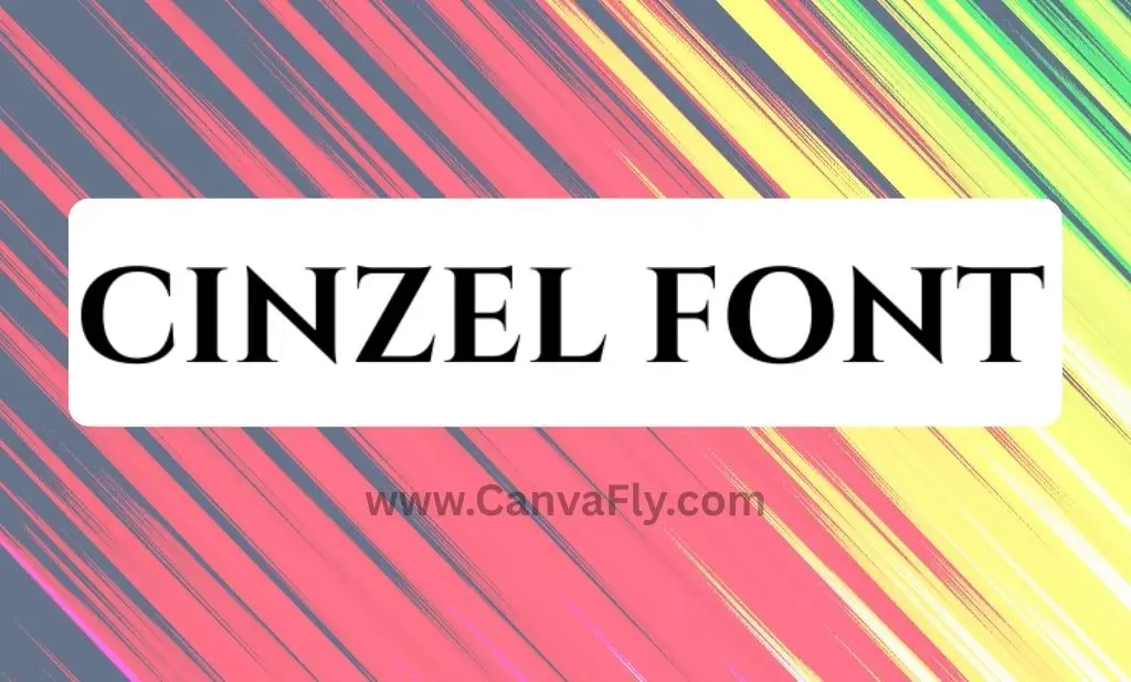
Cinzel Font: Roman Typography That Makes Brands Look Elite
Picture this: you’re scrolling through Instagram, and boom – a brand logo stops you dead in your tracks. It’s got that ancient Roman emperor vibe but feels fresh enough for today’s feed. Chances are, you just met the Cinzel font. This sophisticated serif typeface isn’t just another pretty face in the typography world – it’s the secret weapon luxury brands use to whisper “class” without saying a word.
The Cinzel font bridges 2,000 years of design history, taking inspiration from first-century Roman inscriptions and serving it up with modern polish. Think of it as your typography wingman – the one that makes everything look more expensive, more established, more… well, Roman emperor-esque.
Table of Contents
What Makes Cinzel Font Your Brand’s Secret Weapon
Let’s cut to the chase – Cinzel font isn’t your average typeface. Designed by Natanael Gama in 2012, this beauty draws its DNA from ancient Roman capital letterforms, particularly those chiseled into monumental inscriptions. It’s like having Caesar’s personal scribe design your logo, minus the togas and political drama.
Here’s what sets this font apart from the typography crowd:
- Sharp, Clean Serifs: Each letter feels like it was carved with precision. No wobbly lines or uncertain strokes – just confident, razor-sharp details that command attention.
- Multiple Weight Options: From Regular to Black, Cinzel font gives you six different weights to play with. Need subtle elegance? Go Regular. Want to make a statement that echoes through the digital colosseum? Black’s your move.
- Decorative Version Available: Cinzel Decorative brings the ornamental flair with swashes and flourishes for when you need that extra dose of sophistication.
The catch? This font lives primarily in uppercase and small caps territory. But honestly, that’s not a bug – it’s a feature. Just like those ancient Roman inscriptions that inspired it, Cinzel font works best when it’s making grand statements, not whispering sweet nothings in body text.
Why Everyone’s Obsessing Over This Roman-Inspired Typography
The Cinzel font phenomenon isn’t just about looking pretty – it’s about psychology. When someone sees this typeface, their brain immediately connects it with tradition, prestige, and that “this brand has been around forever” vibe. It’s the typography equivalent of a perfectly tailored suit or a vintage wine that gets better with age.
Available through Google Fonts and Adobe Fonts, this open-source heavyweight can be used freely for both commercial and personal projects. Translation: you can add Roman emperor energy to your brand without breaking the bank or hiring a team of ancient stone carvers.
Here’s the real kicker – Cinzel font works because it taps into something primal. Humans have been associating Roman aesthetics with power, stability, and sophistication for centuries. When you slap this font on your brand, you’re not just choosing typography; you’re borrowing 2,000 years of cultural gravitas.
The Cinzel Font Family Tree: Meet the Relatives
While Cinzel font is undoubtedly the star of the show, it’s got some serious competition in the classical typography space. Think of these as the font equivalent of a Roman senate – each bringing their own flavor of ancient authority:
- Trajan and Trajan Bold pull from the same historical well – the famous Trajan’s Column inscription. They’re like Cinzel’s scholarly cousins who spent extra time in the library studying ancient texts.
- Pontif shares those classical proportions and serif characteristics that make your design feel established and trustworthy. It’s the diplomatic choice when you want Roman energy with a slightly different personality.
- Forum offers another Google Fonts option with Roman-inspired letterforms. Think of it as the more approachable member of the family – still classy, but with a friendlier smile.
- Goudy Trajan brings the establishment credibility as a well-respected typeface with similar historical roots. It’s like the distinguished professor of the group.
For brands looking to level up from free options, premium alternatives like Montage Serif Font deliver similar stroke contrast and sharp edges, while Giveny Classy Serif Font adds elegant ligatures for special projects that need extra sophistication.
Strategic Font Pairing: Making Cinzel Play Nice with Others
Here’s where the magic happens – Cinzel font doesn’t have to work alone. The most compelling designs happen when you pair this classical heavyweight with complementary typefaces that enhance its strengths without competing for attention.
- The Contemporary Luxury Combo: Pair Cinzel font with modern sans-serifs like Montserrat or Open Sans. This creates a bridge between timeless and contemporary, perfect for luxury brands that want to honor tradition while staying relevant.
- The Elegant Sophistication Mix: Combine classical serifs with clean script fonts. This pairing whispers sophistication and works beautifully for high-end services or products that want to convey both heritage and personal touch.
- The Dynamic Contrast Approach: Use Cinzel font for headers and bold display needs, then pair it with refined, readable body text fonts. This creates visual hierarchy while maintaining that premium feel throughout your design.
- The key is balance. Cinzel font commands attention, so your supporting typeface should complement, not compete. It’s like pairing a statement piece with classic basics – let the star shine while everything else supports the overall look.
Brand Psychology: Why Cinzel Makes Your Business Look Established
Typography isn’t just about looking pretty – it’s about communicating personality and values before anyone reads a single word. When customers see Cinzel font, their brains automatically file your brand under “sophisticated,” “established,” and “trustworthy.”
This psychological impact is particularly powerful for luxury positioning. Serif fonts like Cinzel font carry associations with heritage, craftsmanship, and premium quality. It’s the visual equivalent of a firm handshake and confident eye contact – it communicates competence without having to prove it.
For service-based businesses, this credibility boost can be game-changing. When potential clients see Cinzel font on your materials, they’re more likely to perceive your business as professional and detail-oriented. It’s the difference between looking like you just started yesterday and appearing like you’ve been the go-to expert for years.
The font also creates what psychologists call “cognitive ease” – when something looks familiar and established, our brains process it as safer and more trustworthy. Cinzel font leverages centuries of positive associations with Roman-inspired design to give your brand an instant credibility boost.
Technical Considerations: Making Cinzel Work in the Real World
Let’s talk practical implementation. Cinzel font shines in digital applications, but like any sophisticated tool, it needs to be used correctly. The font maintains excellent readability across various screen sizes, making it perfect for responsive web design and mobile applications.
For brand consistency, establish clear hierarchies using different weights of Cinzel font. Use the bolder weights for primary headlines and logos, medium weights for subheadings, and lighter weights for supporting text elements. This creates visual flow while maintaining that cohesive Roman-inspired aesthetic.
One crucial consideration: licensing. While Cinzel font is open-source and free for commercial use, as your brand grows, you might want to consider custom typography development for complete differentiation. Custom fonts ensure no competitor can replicate your exact visual identity, providing the ultimate brand protection.
Implementation Strategy: From Roman Roads to Digital Highways
Rolling out Cinzel font across your brand requires strategy, not just good taste. Start with your primary touchpoints – logo, website headers, and key marketing materials. These high-impact applications let you test how the font performs in your specific context.
For established brands considering a typography refresh, conduct competitive analysis first. See how others in your space are using fonts, then position Cinzel font as your differentiator. If everyone’s going modern and minimal, your classical sophistication will stand out like a marble statue in a sea of glass boxes.
New brands have more flexibility to build their entire visual identity around Cinzel font. Develop clear typographic hierarchies from day one, creating brand guidelines that specify when and how to use each weight. This foundation will serve you well as you scale.
Cinzel Font Applications Table:
| Application | Recommended Weight | Best Practices |
|---|---|---|
| Logo/Wordmark | Bold to Black | Use sparingly, ensure scalability |
| Headlines | SemiBold to Bold | Perfect for grabbing attention |
| Subheadings | Medium to SemiBold | Creates clear hierarchy |
| Accent Text | Regular to Medium | Use for quotes, callouts |
| Body Text | Not recommended | Pair with complementary font instead |
The Future of Classical Typography in Modern Branding
Typography trends come and go, but classical influences like Cinzel font have staying power. We’re seeing a resurgence of serif fonts as brands seek to differentiate themselves from the sea of generic sans-serif logos that dominated the 2010s.
The smart money is on fonts that balance timeless appeal with contemporary functionality. Cinzel font hits this sweet spot perfectly – it’s rooted in history but optimized for modern applications. As digital experiences become increasingly important, fonts that can carry emotional weight while maintaining technical performance will continue to thrive.
Variable fonts and custom typography are also gaining traction, offering brands even more ways to create unique visual identities. While Cinzel font provides an excellent starting point, many successful brands eventually develop custom variations that capture their specific personality while maintaining that classical foundation.
Making the Executive Decision: Is Cinzel Right for Your Brand?
Cinzel font isn’t for everyone, and that’s exactly why it works so well for the right brands. If you’re in luxury goods, professional services, hospitality, or any industry where trust and sophistication matter, this font could be your secret weapon.
Consider your target audience – are they drawn to heritage and craftsmanship, or do they prefer cutting-edge innovation? Cinzel font speaks to people who appreciate quality, tradition, and attention to detail. If that describes your ideal customer, you’ve found your typography match.
The font works particularly well for brands that want to convey stability and longevity without feeling outdated. It’s the perfect choice for businesses that are actually new but want to feel established, or established businesses that want to honor their heritage while staying relevant.
Remember, typography is an investment in your brand’s future. Choose Cinzel font not just because it looks good today, but because it will continue representing your values and connecting with your audience for years to come.
Conclusion: Your Typography Crown Awaits
Cinzel font represents more than just letterforms – it’s a strategic brand decision that connects your business to centuries of design heritage while keeping you firmly planted in the present. Whether you’re crafting a luxury brand identity, elevating a professional service, or simply want typography that commands respect, this Roman-inspired typeface delivers the gravitas your brand deserves.
The beauty of Cinzel font lies in its ability to make any brand feel more established, more sophisticated, and more trustworthy. It’s not about pretending to be something you’re not – it’s about presenting your best self with confidence and style.
Ready to give your brand that emperor-level presence? Cinzel font is waiting to transform your typography from forgettable to unforgettable. After all, in a world full of generic fonts, why not choose one that’s been tested by 2,000 years of human civilization?
What’s your take on classical typography in modern branding? Ready to add some Roman gravitas to your next design project?
Frequently Asked Questions About Cinzel Font
Is Cinzel font free to use for commercial projects?
Yes, Cinzel font is completely free for both personal and commercial use. It’s available through Google Fonts and Adobe Fonts as an open-source typeface, so you can use it for client work, business logos, and commercial applications without paying licensing fees.
What’s the difference between Cinzel and Cinzel Decorative?
Regular Cinzel font features clean, classical letterforms perfect for professional branding and headlines. Cinzel Decorative adds ornamental elements, swashes, and flourishes for more elaborate design needs like wedding invitations, luxury packaging, or decorative headers.
Why doesn’t Cinzel work well for body text?
Cinzel font was designed primarily for uppercase and small caps format, inspired by ancient Roman inscriptions that used only capital letters. This makes it perfect for headlines, titles, and branding but less readable for long-form text. Pair it with complementary fonts for body copy.
What fonts pair best with Cinzel?
Cinzel font pairs beautifully with modern sans-serifs like Montserrat, Open Sans, or Lato for contemporary luxury feels. For more traditional elegance, try pairing it with clean serif body fonts or refined script typefaces. The key is choosing fonts that complement without competing.
Can I use Cinzel for my startup logo?
Absolutely! Cinzel font works exceptionally well for startups wanting to appear established and trustworthy from day one. It’s particularly effective for luxury services, professional consultancies, premium products, or any business where credibility and sophistication matter.
How do I know if Cinzel is right for my brand?
Cinzel font works best for brands targeting audiences who value tradition, quality, and sophistication. If your customers appreciate heritage, craftsmanship, or premium experiences, this font aligns perfectly. It’s ideal for luxury brands, professional services, hospitality, and established businesses.
What’s the best weight of Cinzel to use for logos?
For logos, start with Cinzel font in SemiBold to Bold weights. These provide strong presence while maintaining readability at various sizes. Test your logo at different scales – from business cards to billboards – to ensure it maintains impact and legibility across all applications.