7 Best College Font Sources: Ultimate Design Guide
Remember those iconic letterman jackets? The bold, blocky letters that screamed “champion” from across the quad? That’s the power of a good college font – it doesn’t just spell words, it tells stories of tradition, achievement, and that unmistakable collegiate swagger.
Whether you’re designing team merch, creating academic materials, or just want to add some varsity flair to your project, understanding collegiate typography selection is your secret weapon. These aren’t just typefaces – they’re visual shorthand for everything we associate with academic excellence and athletic prowess.
Table of Contents
What Makes a College Font Actually Collegiate
A college font isn’t just any bold typeface you slap on a design. It’s got DNA – specific characteristics that separate the pros from the wannabes. Think of it like the difference between a tailored suit and something off the rack.
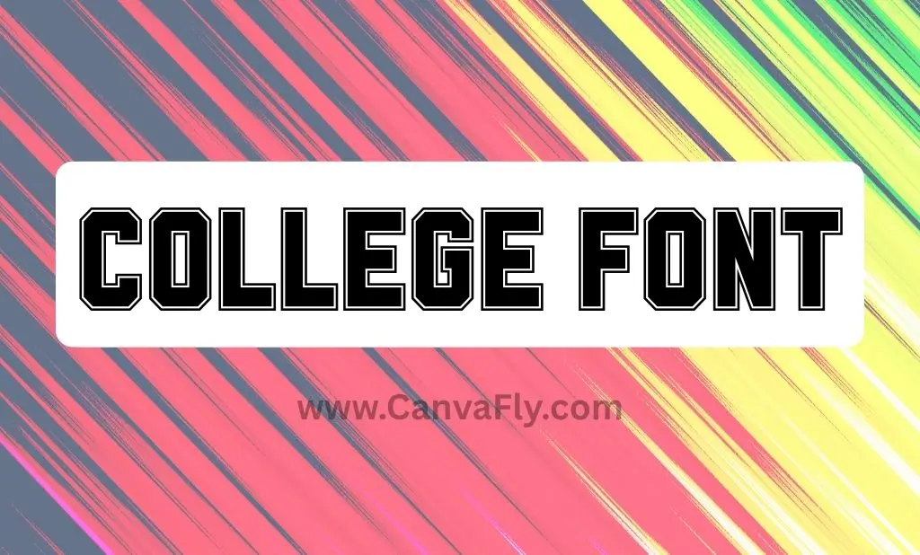
Bold, block letters are the foundation. These college font styles command attention like a star quarterback calling plays. They’re built to be seen from the nosebleed seats and still pack a punch up close.
Distinctive serifs or sharp angles add personality. These aren’t your grandmother’s serif fonts – they’re architectural, purposeful, and often mimic the hand-cut lettering you’d find on vintage athletic wear.
Evocation of tradition runs deep. The best college font options carry an inherent sense of history, linking back to established institutions and legendary sports rivalries. They whisper “legacy” while shouting “victory.”
The Heavy Hitters: Where to Score Your Collegiate Typography
Gone are the days when you had to raid the design department for decent typography. Today’s college font landscape is rich with options that won’t break the bank or your creative vision.
Free Resources That Actually Deliver
DaFont remains the MVP of free college font resources. Their “College” typeface by Matthew Welch is basically the gold standard – vintage appeal with modern versatility. It comes with multiple file variations, making it adaptable for everything from retro-themed designs to contemporary applications.
1001Fonts brings serious variety to the table. With over a hundred free college font options, you’re not just getting choices – you’re getting a full toolkit for academic assignments, personal projects, and light commercial use.
FontSpace specializes in sports and collegiate themes. Their “Sporting Outline” by Pentype Studio and “Atlanta College” by GraphicSauce are standout college font examples that’ll make your designs look like they belong in the pros.
Google Fonts keeps it clean with options like “Graduate.” When you need web compatibility and crisp aesthetics, this platform delivers college font styles that work beautifully across digital and print applications.
Premium Platforms for the Pros
Adobe Fonts comes with your Creative Cloud subscription and offers the kind of quality that separates amateur hour from professional work. These college font collections include extensive licensing and support, ensuring consistency across all your design applications.
Envato Elements brings unique options like “The Jersey – Quirky College Font” with enhanced features and commercial licenses. Perfect for intricate branding campaigns that need something special.
Creative Market curates college font bundles often packaged with additional design elements. It’s like getting a complete design system, not just a typeface.
College Font Applications That Actually Work
College font designs aren’t one-trick ponies. Their versatility extends across design disciplines, making them indispensable for projects that need to communicate school spirit, athletic tradition, or enduring quality.
Branding That Builds Legacy
Universities and athletic programs use college font styles to project heritage and authority. These typefaces appear on official logos, sports team uniforms, and merchandise because they instantly communicate institutional pride and athletic excellence.
The blocky, bold nature makes them perfect for sports jerseys and team banners – they provide high visibility and that unmistakable athletic feel that fans expect.
Digital and Print Mastery
Beyond traditional branding, college font applications excel in digital and print publications. They work beautifully for website headers, social media graphics, yearbooks, and graduation materials. The key is understanding when their bold presence enhances your message versus overwhelming it.
| Application Area | Best Use Cases | Why College Font Works |
|---|---|---|
| Education & Academia | University logos, graduation certificates, school signage | Conveys tradition, authority, and academic excellence |
| Sports & Athletics | Team jerseys, sports banners, fan apparel | Projects strength, team spirit, and athletic pride |
| Digital Design | Website headers, social media graphics, online courses | Adds strong visual identity and brand recognition |
| Print Media | Posters, flyers, yearbooks, invitations | Ensures high legibility and impactful messaging |
The Psychology Behind College Font Appeal
College font designs tap into powerful psychological associations. They’re visual triggers that activate our connections to achievement, tradition, and belonging. When someone sees a well-executed college font, they’re not just reading text – they’re experiencing a sense of institutional pride and athletic heritage.
This psychological impact makes them incredibly effective for modern typography applications where you need to communicate authority and tradition simultaneously. The bold, assertive character projects confidence while the traditional elements suggest reliability and heritage.
Design Considerations That Matter
Using collegiate typography effectively isn’t about slapping them onto any design. It’s about understanding how to integrate them for maximum impact while maintaining readability and visual hierarchy.
Readability Rules Everything
Bold doesn’t mean illegible. Ensure your typography remains readable, especially at smaller sizes or against complex backgrounds. The goal is impact, not confusion.
Context Is King
A super-athletic typeface might dominate a formal academic paper but be perfect for a sports event announcement. Understanding your audience and message determines your typography choice.
Pairing for Success
Collegiate typefaces often work beautifully with simpler sans-serif options for body text. This creates strong visual hierarchy while letting your varsity typography shine where it matters most.
Current Trends in Collegiate Typography
The collegiate typeface landscape continues evolving. Modern interpretations prioritize legibility and versatility for broader digital use while maintaining those essential varsity characteristics. We’re seeing increased interest in layered effects and varsity patch aesthetics that emulate stitched, layered appearances on athletic uniforms.
- Vintage-inspired variations are particularly popular, drawing from classic design aesthetics while offering contemporary functionality. These typefaces evoke nostalgia while working seamlessly in modern design contexts.
- Digital-first designs are emerging that maintain collegiate spirit while optimizing for screen readability and responsive design requirements.
Licensing: The Fine Print That Matters
Understanding typography licensing isn’t just legal homework – it’s practical business sense. Many collegiate typefaces are free for personal use but require separate licenses for commercial projects. Always check usage rights before incorporating typography into projects intended for commercial purposes.
The distinction between personal and commercial use can be subtle but significant. Selling merchandise, creating business logos, or using typefaces in client work typically requires commercial licensing, even if the typeface was initially free to download.
Mastering the Varsity Aesthetic
Creating authentic collegiate designs goes beyond typeface selection. The most effective applications often incorporate techniques that emulate the stitched, layered appearance of letters on athletic uniforms and jackets.
Professional designers frequently use layering techniques, outline effects, and shadow work to achieve that distinctive varsity patch look. These techniques transform standard collegiate typography into authentic-looking athletic lettering that resonates with audiences.
FAQ: Your Collegiate Typography Questions Answered
What exactly defines a college font?
Collegiate typefaces are characterized by bold, block letters with distinctive serifs or sharp angles. They mirror the aesthetic of varsity jackets and university signage, evoking tradition, achievement, and institutional pride.
Are collegiate typefaces free for commercial use?
Most are free for personal use only. Commercial applications typically require separate licensing. Always check the specific usage rights before using typography in business projects.
What are the most popular collegiate typeface examples?
Top choices include Matthew Welch’s “College” from DaFont, “Graduate” from Google Fonts, and “Sporting Outline” from FontSpace. These options are widely used for their authentic varsity aesthetic.
Where can I download quality collegiate typography?
Free options include DaFont, 1001Fonts, and FontSpace. Premium platforms like Adobe Fonts, Envato Elements, and Creative Market offer professional-grade collections with commercial licensing.
What software works best with collegiate typefaces?
These work with standard design software including Adobe Photoshop, Illustrator, Cricut Design Space, and Silhouette Studio. Ensure files (.ttf, .otf) are compatible with your chosen platform.
How do I create that varsity patch effect?
The varsity patch look requires layering techniques, often involving multiple weights, outlines, and shadow effects. Many designers use specialized tutorials to achieve this authentic athletic aesthetic.
What’s the best college font for small text?
For smaller applications, prioritize readability over decorative elements. Simpler collegiate designs with clean lines work better than highly ornate options that might become illegible at reduced sizes.
Do collegiate typefaces work for modern designs?
Absolutely. Contemporary interpretations balance traditional varsity elements with modern design requirements, making them suitable for both vintage-inspired and contemporary applications.
Making Your Mark with Collegiate Typography Excellence
Collegiate typefaces aren’t just typography choices – they’re strategic design decisions that communicate values, heritage, and aspirations. Whether you’re creating the next iconic sports logo or designing academic materials that command respect, understanding varsity typography gives you a competitive edge.
The key is matching your typeface selection to your message and audience. Bold, traditional options work beautifully for established institutions, while modern interpretations suit contemporary applications that need collegiate spirit with contemporary functionality.
Remember: the best college font is the one that enhances your message while maintaining readability and visual impact. It should feel authentic to your brand while serving your practical design needs.
From the free resources that deliver professional results to the premium platforms that offer comprehensive licensing, today’s collegiate typography marketplace provides options for every project and budget. The question isn’t whether you can find the right varsity typeface – it’s whether you’ll choose the one that truly captures your vision and communicates your message with the authority and tradition that only great collegiate design can deliver.
Your designs deserve typography that works as hard as you do. Choose wisely, design boldly, and let your typeface choice speak volumes about your commitment to excellence.