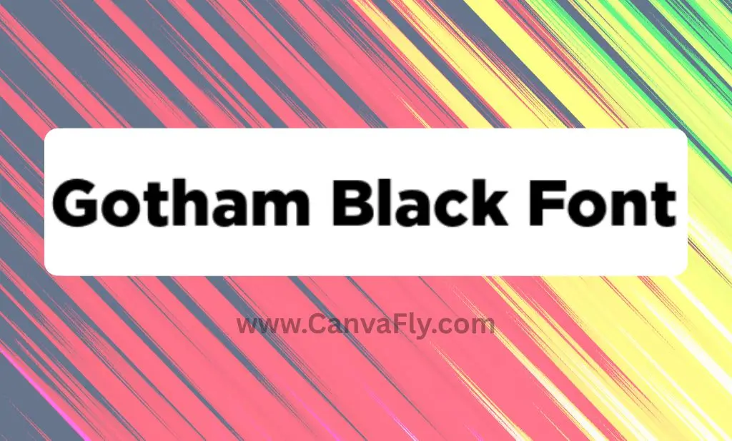
10 Gotham Black Font Secrets That Transform Brand Design
When Netflix’s bold logo commands attention or Obama’s iconic “HOPE” poster inspires millions, there’s one secret weapon behind the visual impact: Gotham Black font. This isn’t just typography – it’s brand psychology in action.
Since 2002, this geometric powerhouse has shaped some of the most memorable brand moments in modern history. From presidential campaigns to Fortune 500 companies, Gotham Black continues to define what authority and authenticity look like in the digital age.
Table of Contents
What Makes Gotham Black Font Special
Gotham Black represents the heaviest weight in the iconic Gotham typeface family, designed by Tobias Frere-Jones and Jesse Ragan in 2000. But what transforms it from another bold font into a brand-building powerhouse?
Core Design Principles
Geometric Precision: Clean lines and mathematical proportions create instant visual authority without overwhelming complexity.
Architectural Heritage: Inspired by mid-20th century American building signage, Gotham Black carries authentic cultural resonance that connects with audiences on a subconscious level.
Balanced Personality: The font achieves that rare sweet spot – assertive without being aggressive, professional without being sterile.
Universal Legibility: High x-height and wide apertures ensure crystal-clear readability across all sizes and mediums.
Technical Specifications
- Character Set: 66+ weight variations including italics and condensed versions
- Language Support: Extended Latin, Cyrillic, and Greek characters
- File Formats: OpenType (.otf), TrueType (.ttf), Web fonts (WOFF, WOFF2)
- Optimal Use: Headlines, logos, emphasis text, short-form content
The Psychology Behind Gotham Black Font’s Power
Typography isn’t just about aesthetics – it’s psychological warfare in the best possible way. When audiences see Gotham Black, their brains process far more than just letters. They’re absorbing emotions, personalities, and perceptions that can make or break brand trust.
Emotional Impact Analysis
Authority Without Intimidation: Gotham Black projects confidence while remaining approachable. This balance makes it perfect for brands that need to establish credibility without alienating their audience.
Cultural Resonance: The font’s architectural DNA connects with American ideals of progress and authenticity, making it particularly effective for brands targeting US audiences.
Cognitive Processing: Studies show that geometric sans-serifs like Gotham Black are processed faster by the brain, creating immediate comprehension and trust.
Brand Personality Mapping
The typeface works exceptionally well for brands that want to communicate:
- Modern innovation with established credibility
- Professional expertise with human approachability
- Bold leadership with democratic values
- Premium quality with accessible pricing
Real Brand Success Stories
Political Campaigns That Changed History
Obama 2008 Campaign: The strategic use of Gotham Black in “HOPE” and “CHANGE” posters created visual consistency that reinforced message authenticity. The typography became synonymous with progressive leadership.
Trump 2024 Campaign: Demonstrated Gotham’s versatility by projecting strength and decisiveness for a completely different political brand, proving the font’s adaptability across messaging strategies.
Corporate Giants
Spotify: Uses Gotham Black for its brand wordmark, communicating innovation and accessibility in the music streaming space.
GQ Magazine: Leverages the font’s sophisticated edge to maintain cultural relevance while projecting editorial authority.
Saturday Night Live: Employs Gotham Black in promotional materials to balance entertainment value with institutional credibility.
Download Options & Licensing
Official Licensing Sources
Gotham Black font download requires proper licensing through professional foundries. Hoefler&Co (formerly Hoefler & Frere-Jones) offers the complete family with licensing options ranging from $200-500+ depending on usage requirements.
Licensing Considerations
- Desktop License: For print and static digital use
- Web License: For website typography and online applications
- App License: For mobile application integration
- Enterprise License: For large-scale corporate deployment
Budget-Friendly Alternatives
When official licensing isn’t feasible, several high-quality alternatives capture Gotham’s essence without the premium price tag.
Best Free Alternatives
Top-Tier Free Options
Metropolis: The closest Gotham Black font free alternative available. Maintains geometric confidence with subtle character differences that preserve the original’s impact while offering unique personality.
Montserrat: Inspired by urban signage like Gotham, this Google Font provides multiple weights and variable font options for maximum design flexibility. Available in 18 weights from Thin to Black.
Figtree: Captures Gotham’s architectural solidity while bringing distinctive character. Offers 7 weights plus italics through Google Fonts, making it perfect for comprehensive brand systems.
Raleway: With careful implementation, approximates Gotham Black’s visual weight while maintaining its own sophisticated character. Excellent for brands seeking similar impact with unique identity.
For creative projects requiring bold geometric fonts, consider exploring graffiti fonts that complement Gotham’s urban aesthetic while maintaining professional appeal.
Premium Alternatives Worth Investment
TT Norms Pro: A functional geometric sans serif with stylish elegance across multiple weights, perfect for brands wanting Gotham’s professionalism with unique character.
TT Commons Pro: Versatile geometric sans serif supporting 275+ languages, ideal for global brands needing comprehensive international typography.
Acherus Grotesque: Combines geometric structure with unique details for distinctive branding that stands apart from typical Gotham implementations.
Proxima Nova: Another excellent geometric option that pairs beautifully with Gotham-style designs. Check out our Proxima Nova font collection for comprehensive pairing strategies.
Strategic Font Pairing
Pairing Principles That Work
Contrast Creates Hierarchy: Gotham Black pairs exceptionally well with serif typefaces like Times New Roman or Georgia for body text, creating clear visual hierarchy while maintaining readability.
Weight Progression: Use Gotham Black for headlines, then step down to Gotham Regular or Light for subheadings, creating seamless brand consistency across all content levels.
Complementary Personalities: Pair with fonts that share similar confidence levels but different structural approaches, such as slab serifs for industrial feels or elegant sans-serifs for tech applications.
Successful Pairing Examples
- Gotham Black + Georgia: Perfect for editorial content requiring authority and readability
- Gotham Black + Helvetica Neue Light: Modern, clean combination for tech and startup brands
- Gotham Black + Crimson Text: Sophisticated pairing for luxury and premium brands
Pairings to Avoid
Never pair Gotham Black with other heavy geometric sans-serifs as this creates visual competition instead of harmony. Also avoid ornate script fonts that clash with Gotham’s clean geometric nature.
For digital applications like social media, ensure your font choices maintain readability across different screen sizes and platforms.
Implementation Best Practices
Brand Strategy Alignment
Before implementing Gotham Black, ensure it aligns with your core brand values. The font should reinforce your brand personality rather than compete with it.
For Professional Services: Use Gotham Black sparingly for maximum impact – logos, main headlines, and key call-to-action buttons.
For Creative Industries: Balance Gotham’s structure with more experimental typography for supporting elements.
For Technology Brands: Leverage Gotham’s modern appeal while ensuring technical readability across all platforms.
Cross-Platform Optimization
Test Gotham Black across all brand touchpoints:
- Digital: Websites, social media, email campaigns
- Print: Business cards, brochures, outdoor advertising
- Environmental: Signage, trade show displays, office graphics
Hierarchy Development
Create clear typographic hierarchies using Gotham’s weight variations:
- Gotham Black: Primary headlines and brand elements
- Gotham Bold: Secondary headlines and emphasis
- Gotham Regular: Body text and supporting content
- Gotham Light: Captions and supplementary information
Common Mistakes to Avoid
Overuse Issues
The “Everything Bold” Trap: Using Gotham Black throughout entire designs overwhelms readers and reduces its impact. Reserve it for key brand moments.
Size Misapplication: Gotham Black works best at larger sizes. Using it for small body text reduces legibility and creates visual fatigue.
Context Mismatches
Industry Misalignment: While versatile, Gotham Black isn’t suitable for every industry. Avoid using it for children’s brands, luxury fashion, or traditional/conservative sectors where it might feel too aggressive.
Cultural Considerations: The font’s American architectural heritage might not resonate in all international markets. Test with local audiences before global implementation.
Technical Pitfalls
File Format Confusion: Ensure you’re using appropriate font formats (WOFF2 for web, OTF for print) to maintain quality across applications.
Loading Performance: Web fonts can impact site speed. Implement proper font loading strategies to prevent layout shifts and performance issues.
Advanced Typography Strategies
Custom Modifications
Consider working with type designers to create custom variations of Gotham Black for truly unique brand identity. This prevents the “everyone uses Gotham” problem while maintaining its core appeal.
Variable Font Implementation
When available, use variable font versions for more precise control over weight and spacing, especially in responsive web design applications.
Brand System Integration
Develop comprehensive guidelines for Gotham Black usage across all brand touchpoints. Document spacing, sizing, color applications, and contextual usage rules.
Looking for inspiration on comprehensive font usage? Our guide to best Canva fonts for 2024 showcases effective typography systems in action.
Frequently Asked Questions
1. Where can I get a legitimate Gotham Black font download?
Gotham Black font download is available through Hoefler&Co with licensing fees ranging from $200-500+ based on usage requirements. Always ensure proper licensing for commercial use.
2. What are the best free alternatives to Gotham Black?
The closest Gotham Black font free alternatives include Metropolis, Montserrat, Figtree, and Raleway. Metropolis offers the most similar geometric structure and visual weight.
3. How do I create effective Gotham Black font pairing combinations?
Effective pairing relies on contrast and hierarchy. Combine Gotham Black with serif fonts for contrast, lighter sans-serifs for hierarchy, or slab serifs for industrial aesthetics.
4. Which brands successfully use Gotham Black font?
Notable users include political campaigns (Obama 2008, Trump 2024), media brands (GQ, Saturday Night Live), and corporations (Spotify, Michigan State University, Cartoon Network).
5. Can Gotham Black be used for body text?
While technically possible, Gotham Black’s heavy weight makes it better suited for headlines and emphasis. Use lighter Gotham weights for extended reading comfort.
6. What file formats are available for Gotham Black?
Downloads typically include OpenType (.otf) and TrueType (.ttf) formats, with web font versions (WOFF, WOFF2) available for digital applications.
7. How does Gotham Black perform in digital environments?
Excellent digital performance due to high x-height and wide apertures. It maintains legibility across devices and screen sizes, making it ideal for responsive design.
8. What’s the difference between Gotham Black and other weights?
Gotham Black represents the heaviest weight in the family, offering maximum visual impact while maintaining geometric clarity. It’s specifically designed for attention-grabbing applications.
9. How do I avoid overusing Gotham Black in designs?
Balance with lighter weights and complementary typefaces. Use strategically for key brand elements rather than throughout entire designs. Create clear hierarchy with adequate white space.
10. Is Gotham Black suitable for international brands?
While versatile, its American architectural heritage might not resonate universally. Test with local audiences and consider cultural context before international implementation.
For professional design projects requiring multiple weights and sophisticated typography systems, consider exploring Termina font as another geometric alternative with unique character.
The Bottom Line: Gotham Black’s Strategic Value
Gotham Black font isn’t just another typeface – it’s a strategic brand asset that shapes audience perception at the subconscious level. Whether implementing the official version or exploring alternatives, success lies in understanding that typography communicates far more than words alone.
The most effective brands treat Gotham Black as a core strategic element, not a decorative afterthought. In today’s crowded marketplace, thoughtful typography choices offer powerful differentiation tools for creating memorable, resonant brand identities.
Key Takeaways for Strategic Implementation:
- Align font choice with core brand values and personality
- Test across all applications before full implementation
- Create comprehensive usage guidelines for consistency
- Balance impact with readability across all touchpoints
- Consider cultural context for international applications
Ready to transform your brand with strategic typography? Start by defining your brand personality, then let Gotham Black – or its strategic alternatives – become the visual voice that connects with your audience’s deeper psychological triggers.
Great design isn’t just about aesthetics – it’s about creating emotional connections that drive real business results.