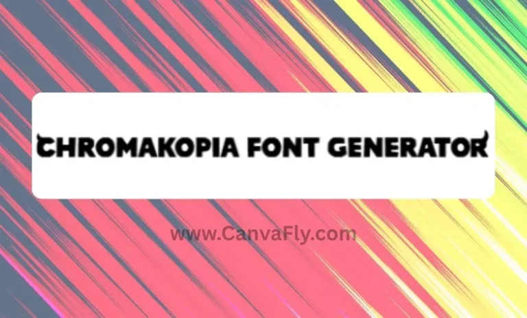
7 Powerful Grobold Font Secrets That Transform Your Brand Design
You’ve seen it everywhere – that bold, cartoon-style lettering that somehow looks both playful and professional. That’s the Grobold font working its magic, and it’s been quietly revolutionizing how brands communicate for nearly two decades. While everyone else is playing it safe with Arial and Times New Roman, smart designers have been leveraging this typographic secret weapon to make their work pop.
The Grobold font isn’t just another pretty typeface sitting in your font library gathering digital dust. It’s a strategic tool that bridges the gap between serious business and creative expression, giving your brand that rare combination of approachability and authority. Whether you’re designing for a tech startup that wants to seem less intimidating or a traditional company looking to inject some personality, the Grobold font delivers results that speak louder than words.
Table of Contents
What Makes Grobold Font Special
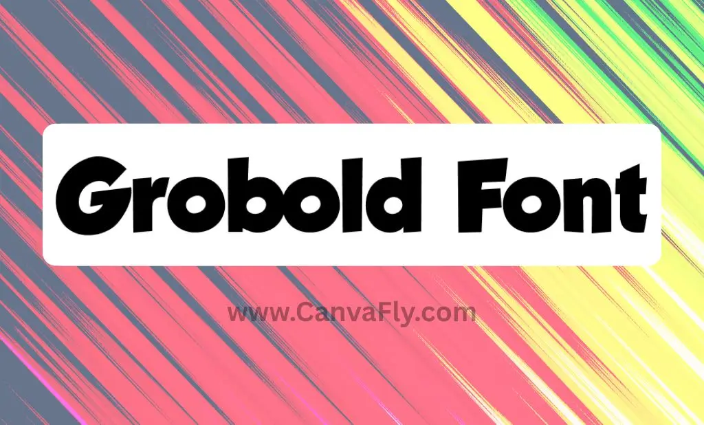
Created by French designer Guy Buhry, the Grobold font first dropped on DaFont back in March 2006. Since then, it’s racked up over 5.5 million downloads – that’s not just popularity, that’s proof of staying power in a world where fonts come and go faster than fashion trends.
What sets the Grobold font apart is its DNA. Buhry drew inspiration from classic heavyweights like Futura and Kabel, then gave them a shot of classic comic book boldness. The result? A typeface that Buhry describes as “naturally tight and compact” – basically, the Grobold font packs maximum visual punch without taking up precious real estate on your designs.
The technical specs tell the real story of its versatility. With 117 defined characters and 116 unique glyphs, the Grobold font covers all the bases for Latin-based languages. We’re talking Basic Latin, Latin-1 Supplement, Latin Extended-A, General Punctuation, and Mathematical Operators. Translation: the Grobold font travels well internationally and won’t leave you hanging when you need special characters.
Why Typography Is Your Brand’s Secret Weapon
Here’s something that’ll blow your mind – MIT research shows that users form opinions about websites within 50 milliseconds. That’s faster than you can say “first impression.” Your font choice is literally shaping how people perceive your brand before they even read a single word.
Typography isn’t just decoration – it’s psychology in action. The right font influences emotions, builds trust, and communicates your brand’s personality instantly. Think about it: when you see Times New Roman, you think “serious newspaper.” When you see Comic Sans, you think… well, let’s not go there. But when you see Grobold, you think “creative confidence meets professional capability.”
This is where most brands mess up. They pick fonts based on what looks nice instead of what works strategically. The smart play? Choose typography that aligns with your brand goals and speaks directly to your target audience’s expectations and desires. This principle applies whether you’re designing resume templates or creating stylish social media content.
The Psychology Behind Font Choices
Different font categories trigger specific psychological responses, and understanding this gives you serious leverage. Serif fonts like Times New Roman project authority and tradition – perfect for publications like The New York Times and The Guardian. Sans-serif fonts like Helvetica scream modernity and neutrality, which is why corporations like Lufthansa and Panasonic love them.
But here’s where it gets interesting: cartoon fonts like the Grobold font occupy their own psychological territory. They communicate playfulness and creativity while maintaining strong visual impact. This psychological principle extends to other bold typography choices – for instance, The Boys font demonstrates how aggressive, distressed lettering can instantly communicate rebellion and strength. This combination is gold for brands that want to seem approachable without sacrificing professionalism.
The cartoon font category has exploded recently as brands realize that humanizing their communications isn’t just nice-to-have – it’s competitive advantage. In 2025, audiences crave authentic connections with brands, and typography that shows personality helps build those emotional bridges. This trend extends beyond traditional cartoon fonts to include graffiti-inspired typography and other expressive typefaces that inject personality into brand communications.
Strategic applications of cartoon typography like the Grobold font extend far beyond children’s products and entertainment brands. Forward-thinking companies across various industries are discovering how fonts like the Grobold font can effectively communicate innovation, creativity, and customer-centricity.
Strategic Applications That Actually Work
Don’t let the “cartoon” label fool you into thinking the Grobold font only works for kids’ brands. Smart companies across industries are using it strategically to differentiate themselves and connect with audiences who appreciate creative confidence.
The versatility is impressive. The Grobold font works brilliantly for clothing brands wanting to project youthful energy, movie promotions that need to grab attention fast, gaming companies communicating fun and excitement, and book publishers targeting contemporary audiences. The Grobold font has been successfully implemented everywhere from manga adaptations for Casterman publishing to iPhone games and commercial websites.
The key is understanding when and how to deploy it. Use the Grobold font for headlines, logos, and attention-grabbing elements where you want personality to shine through. Pair the Grobold font with cleaner fonts for body text to maintain readability while keeping that distinctive brand voice consistent.
How to Download Grobold Font (The Right Way)
Ready to add Grobold to your typography arsenal? You’ve got several solid options for getting your hands on this font, each with its own advantages.
Your first stop should be the original source: DaFont’s Grobold page. This is where it all started, and downloading directly from the source ensures you’re getting the authentic version with proper licensing information. The site clearly marks it as free for personal use, with commercial licensing available.
Alternative download sources include CDN Fonts, Font Download, Fonts4Free, and Free Fonts Family. Each platform offers the same core font but with different download experiences and additional resources.
Pro tip: always verify licensing terms before using any font commercially. While Grobold is available for commercial use, understanding the specific terms protects you and supports the creator’s work.
| Download Source | Best For | Key Advantage |
|---|---|---|
| DaFont | First-time users | Original source with creator info |
| CDN Fonts | Developers | Clean download process |
| Font Download | Designers | Additional font pairing suggestions |
| Fonts4Free | Quick access | Streamlined interface |
Implementing Grobold in Your Brand Strategy
Successfully integrating Grobold (or any distinctive typography) into your brand requires more than just swapping out fonts and calling it a day. You need a strategic approach that considers your brand objectives, audience expectations, and competitive landscape.
Start with a typography audit of your current brand materials. Where are you using fonts now? What message do those current choices send? Are there opportunities to inject more personality without compromising clarity or professionalism?
The contrast strategy works particularly well with Grobold. If your industry typically uses conservative typography, strategic deployment of this font can create immediate differentiation. Tech companies use this approach to humanize complex products, making them more approachable to mainstream audiences.
Consider the personality amplification strategy too. If your brand values creativity, innovation, and approachability, Grobold reinforces these traits visually. Every time someone sees your materials, they’re getting a subconscious reminder of what your brand represents.
Best Practices for Professional Implementation
The secret to using Grobold professionally lies in restraint and strategic application. Don’t go crazy and make everything Grobold – that’s the fastest way to look unprofessional and hurt readability.
Use the hierarchy principle: the Grobold font for headlines and key messaging, paired with clean, readable fonts for body text. This creates visual interest while maintaining functionality. Popular pairings include the Grobold font with Helvetica, Open Sans, or Lato for body text. For more sophisticated font pairing strategies, check out our guide on print-on-demand fonts in Canva which covers professional typography combinations.
Establish clear usage guidelines that specify when and how to use Grobold across different brand touchpoints. Consider sizing minimums (the font’s bold characteristics can become muddy at small sizes), color applications, and spacing requirements.
Testing is crucial. A/B test different typography combinations to see what resonates with your specific audience. Measure engagement rates, conversion performance, and brand recall to build data-driven understanding of what works best for your goals.
Industry Applications and Success Stories
The beauty of Grobold lies in its cross-industry applicability. It’s not pigeonholed into one category, which makes it valuable for brands looking to stand out in unexpected ways.
Gaming and entertainment companies naturally gravitate toward Grobold because it communicates fun and energy. But the real magic happens when unexpected industries embrace it. Financial services companies have used cartoon-style typography to seem more approachable to younger demographics. Healthcare brands leverage it to reduce anxiety and create friendlier patient experiences.
The growing demand for expressive typography reflects broader changes in consumer expectations. Audiences increasingly choose brands that demonstrate authentic personality and creative confidence through their visual communications.
Publishing has been particularly receptive to Grobold’s charm. Beyond the obvious applications in comic books and graphic novels, traditional publishers use it for book covers targeting contemporary audiences who appreciate design-forward thinking.
Typography Trends Shaping 2025
The typography landscape is evolving rapidly, and understanding current trends helps you make smarter font choices. Cartoon and decorative fonts are experiencing renewed interest across diverse brand categories as companies recognize typography’s power as a differentiator.
Digital-first brand experiences have accelerated typography’s strategic importance. Your font needs to perform across devices, platforms, and contexts while maintaining consistency that reinforces brand recognition. This complexity makes font selection more challenging but also more impactful when done right.
The democratization of design tools has created more sophisticated visual literacy among consumers. People notice and appreciate thoughtful typography choices more than previous generations, creating opportunities for brands to communicate nuanced messages through strategic font selection.
Globalization presents additional opportunities for typography-driven differentiation. Fonts like Grobold, with comprehensive character sets and cross-cultural appeal, enable consistent visual identity across international markets while adapting to local preferences.
Competitive Analysis and Positioning
Smart brands use typography audits to understand their competitive landscape and identify differentiation opportunities. If everyone in your industry uses similar fonts, switching to something distinctive like Grobold can create immediate visual separation.
The fragmentation of traditional media has created more touchpoints where typography influences brand perception. From social media platforms to mobile applications and digital advertising formats, consistent typography application across emerging channels becomes increasingly valuable.
Market analysis reveals growing demand for fonts that combine professional credibility with distinctive personality. Grobold successfully bridges these requirements, creating opportunities for brands that recognize and capitalize on this trend.
Maximizing Your Typography Investment
Getting the most from Grobold requires thinking beyond individual design projects toward comprehensive brand strategy. Develop typography guidelines that govern font usage across all communications while maintaining creative flexibility.
Consider pairing strategies that combine Grobold’s distinctive display characteristics with complementary fonts for different applications. This approach creates visual interest while ensuring optimal readability across various content types.
Implement systematic testing and optimization processes to measure typography impact on key performance indicators. Use empirical evidence rather than aesthetic preferences to guide typography decisions and refinements.
Future-Proofing Your Font Strategy
Typography trends evolve, but distinctive fonts like Grobold have demonstrated remarkable staying power. The key lies in understanding why certain fonts remain relevant while others fade into obscurity.
Grobold’s success stems from its balance of personality and functionality. It’s distinctive enough to create differentiation but professional enough for serious business applications. This balance ensures longevity in a rapidly changing design landscape.
As visual communication continues expanding and consumer visual literacy increases, typography’s strategic importance will likely grow. Font selection decisions become increasingly critical for long-term brand success, making strategic choices more valuable than ever.
Making Grobold Work for You
The Grobold font represents more than just another typography option – it’s a strategic tool for brands seeking to differentiate themselves through thoughtful design choices. With over 5.5 million downloads proving its market appeal, the Grobold font offers a proven path to visual distinction without sacrificing professionalism.
Success with distinctive typography like the Grobold font requires balancing personality with functionality, ensuring font choices support rather than compromise core brand objectives. Companies that master this balance while maintaining consistency across communications position themselves to capitalize on typography’s full strategic potential.
Whether you’re refreshing an existing brand or building something new, consider how the right typography choices can amplify your message and create stronger connections with your audience. In a world where first impressions happen in milliseconds, your Grobold font choice might be the competitive advantage you’ve been looking for.
The next time you’re staring at a blank design wondering how to make it pop, remember: sometimes the boldest move is choosing a font that’s bold enough to match your ambitions. Download the Grobold font and see what happens when your typography finally matches your vision. For more typography inspiration and design resources, explore our essential design guides to elevate your creative projects.
Frequently Asked Questions About Grobold Font
Is Grobold font free for commercial use?
Yes, the Grobold font is available for both personal and commercial use. You can download it from DaFont and other legitimate sources with clear licensing terms. Always verify the licensing agreement when downloading to ensure compliance with your specific usage needs.
What font is similar to Grobold?
Fonts similar to Grobold include Komika Axis, BadaBoom BB, and Balloon Extra Bold. These alternatives share the bold, cartoon-style characteristics that make Grobold popular. However, Grobold’s unique “tight and compact” design by Guy Buhry gives it distinctive appeal that’s hard to replicate exactly.
How do I install Grobold font on Windows?
To install the Grobold font on Windows: 1) Download the TTF file from a legitimate source, 2) Right-click the downloaded file, 3) Select “Install” from the context menu, 4) The font will automatically install and appear in your font list. Restart any open applications to access the newly installed Grobold font.
Can I use Grobold font in Canva?
The Grobold font isn’t natively available in Canva’s font library. However, you can upload custom fonts with a Canva Pro subscription. Alternatively, look for similar cartoon-style fonts within Canva’s extensive collection, or create your Grobold designs externally and import them as images.
What makes Grobold font different from Comic Sans?
While both are cartoon-style fonts, Grobold font offers superior design sophistication. Created by Guy Buhry with influences from Futura and Kabel, Grobold maintains professional credibility while Comic Sans is often considered unprofessional. Grobold’s compact, bold design works better for branding and commercial applications.
Is Grobold font good for logos?
Absolutely! The Grobold font excels in logo design due to its bold, distinctive characteristics and excellent scalability. Its tight, compact design ensures readability at various sizes, while its playful-yet-professional appearance makes it perfect for brands wanting to appear approachable without sacrificing credibility.
How many downloads does Grobold font have?
The Grobold font has accumulated over 5.5 million downloads since its release on DaFont in March 2006. This impressive download count demonstrates its sustained popularity and proves its effectiveness across diverse design applications over nearly two decades.
What industries use Grobold font effectively?
The Grobold font works effectively across multiple industries including gaming, entertainment, publishing, fashion, technology startups, and creative agencies. It’s been successfully used in manga publications, iPhone games, commercial websites, and marketing materials for brands seeking to communicate creativity and approachability.
Does Grobold font support multiple languages?
Yes, the Grobold font includes comprehensive character support with 117 defined characters and 116 unique glyphs. It covers Basic Latin, Latin-1 Supplement, Latin Extended-A, General Punctuation, and Mathematical Operators, making it suitable for international applications and multilingual projects.
What’s the best way to pair Grobold font with other fonts?
The most effective approach is using Grobold font for headlines and display text, paired with clean sans-serif fonts like Helvetica, Open Sans, or Lato for body text. This creates visual hierarchy while maintaining readability. Avoid pairing Grobold with other decorative fonts to prevent visual conflict.