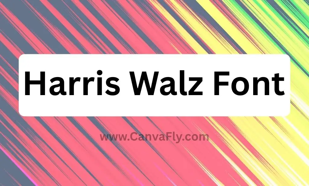
Harris Walz Font: The Typography That Won Political Branding
You’ve seen it everywhere – that bold, confident lettering that screams “HARRIS” from campaign signs, bumper stickers, and social media feeds. But here’s the thing: the Harris Walz font isn’t just some random typeface picked from a designer’s toolkit. It’s a calculated chess move in the branding game, and it’s teaching us some serious lessons about how fonts can flex harder than your favorite sneaker drop.
The Harris Walz font represents one of the most strategic typography decisions in recent political history. While most campaigns play it safe with cookie-cutter fonts, this duo went full maverick with their type choices – and the results? They’re writing the playbook for how smart font selection creates instant brand recognition.
Table of Contents
Breaking Down the Harris Walz Font DNA
Let’s get into the nitty-gritty of what makes this typography tick. The Harris Walz font system isn’t just one typeface – it’s a carefully orchestrated duo that would make any brand strategist jealous.
For “HARRIS,” the campaign chose Sans Plomb, a condensed gothic font that they renamed “Fearless” for the campaign. This French foundry typeface draws inspiration from 1980s French roads and gas station signs – talk about bringing that European sophistication with a dash of retro cool. It’s like wearing a vintage Hermès scarf with your favorite jeans.
The “WALZ” part gets paired with Balto Bold, a contemporary American gothic typeface by Tal Leming. This font has serious pedigree – it references Franklin Gothic and News Gothic traditions, giving it that authoritative, no-nonsense American vibe.
Here’s where it gets interesting: this dual-font approach creates what design experts call visual hierarchy with symbolic meaning. It’s not just pretty letters on a page – it’s strategic communication that works on multiple levels.
The Psychology Behind Political Typography Choices
Typography psychology isn’t some made-up marketing buzzword – it’s real, and it’s powerful. The Harris Walz font choices tap into some deep-seated associations that most people don’t even consciously recognize.
Research shows that condensed gothic fonts like Sans Plomb convey strength, determination, and forward momentum. When you see those thick, compressed letters, your brain automatically associates them with stability and confidence. It’s the same reason luxury car brands love bold, condensed typefaces for their logos.
The French connection adds another layer of sophistication. By choosing Sans Plomb over more conventional American political fonts, the campaign positioned itself as internationally aware and culturally sophisticated – without being pretentious about it.
Meanwhile, Balto Bold brings that all-American authenticity that grounds the ticket in familiar territory. It’s like saying “we’re worldly, but we’re still your neighbors.” Smart move.
Font Alternatives That Could’ve Been Game-Changers
The Harris Walz font system works, but what if they’d gone different routes? Let’s explore some alternatives that share similar DNA:
Condensed Gothic Options:
- Bureau Grot – Actually used in Harris’s 2020 primary campaign, so there’s precedent
- Franklin Gothic – The historical inspiration that influenced their selection
- Trade Gothic – A classic with similar condensed properties
- Griffith Gothic Condensed – A modern revival of telephone book typography
Contemporary Sans Serif Alternatives:
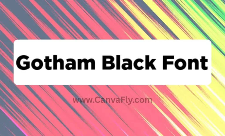
- Gotham – The Obama campaign standard that influenced political typography for years
- Montserrat – Versatile geometric sans serif that’s dominating branding right now
- Helvetica – The timeless choice for clean, modern communication
Each of these would’ve created different emotional responses and brand associations. The fact that they landed on Sans Plomb shows they wanted to break away from predictable political aesthetics.
Current Typography Trends That Influenced the Decision
The Harris Walz font choices didn’t happen in a vacuum – they’re riding some major typography waves that are reshaping how brands communicate.
Variable Fonts are having a moment, offering flexibility across multiple platforms and devices. This matters when your message needs to look sharp on everything from billboard signs to smartphone screens.
Heritage-Inspired Typography is connecting brands with cultural authenticity and trust. Sans Plomb’s roots in French road signage tap into this trend perfectly – it’s got history without being stuffy.
Custom Typography Development is where the big players are investing serious money. Companies like Intel, Nokia, and GE have developed proprietary fonts to create unified brand experiences across global markets.
The Retro Revival trend is bringing back nostalgic typefaces from the 70s, 80s, and Y2K era. Sans Plomb’s 1980s French gas station aesthetic hits this trend perfectly.
Strategic Brand Positioning Through Typography
Here’s where the Harris Walz font strategy gets really interesting – it’s not just about looking good. It’s about strategic brand positioning that creates competitive advantage.
Typography serves as a powerful differentiator in competitive markets. When every other political campaign is using variations of the same safe fonts, going with something distinctive like Sans Plomb immediately sets you apart.
The strategic benefits break down like this:
- Uniqueness and Recognition – Custom or distinctive fonts ensure no competitor shares identical visual identity. You can spot Harris Walz materials from across a crowded room.
- Emotional Connection – Font choices convey brand personality, values, and emotional resonance with target audiences. That French sophistication paired with American authenticity? It’s speaking to voters who want progress without losing their roots.
- Market Differentiation – Strategic typography helps brands stand out in crowded marketplaces. In a field where everyone’s trying to look “presidential,” looking different can be the winning move.
What Commercial Brands Can Learn From Political Typography
The Harris Walz campaign created comprehensive brand guidelines within 107 days, proving that efficient typography systems are achievable under serious pressure. That’s a masterclass in rapid brand development that any startup should study.
The symbolic meaning behind their font choices offers another lesson. Choosing French typography (Sans Plomb) over American alternatives suggests intentional positioning away from conventional political aesthetics. Commercial brands can apply this same principle – sometimes the best move is zigging when everyone else is zagging.
The hierarchical communication strategy – using different fonts for different elements – creates visual priority and memorability. This isn’t just political campaign wisdom; it’s fundamental branding strategy that works across industries.
Custom Font Development as Competitive Strategy
Leading brands are increasingly investing in custom typography to achieve market differentiation. The Harris Walz approach shows how adapting and renaming existing fonts (Sans Plomb becoming “Fearless”) can create that custom feel without the massive investment of building from scratch.
The benefits of custom font development include:
- Exclusive Brand Asset – No competitor gets access to identical typography. It’s like having a trademark on your voice.
- Perfect Brand Alignment – Typography tailored to specific brand personality and values creates seamless brand experiences.
- Long-term ROI – Single investment creates lasting competitive advantage across all applications. Every touchpoint reinforces your unique identity.
Implementation Strategy for Your Brand
Whether you’re running a political campaign, launching a startup, or refreshing an established brand, the Harris Walz font strategy offers a roadmap for strategic typography implementation.
Step 1: Brand Personality Assessment Start by defining your core brand values and target audience characteristics. The Harris Walz team clearly identified their need to balance international sophistication with American authenticity before they ever looked at fonts.
Step 2: Competitive Analysis Audit competitor font choices to identify market gaps. If everyone in your industry is using similar typefaces, that’s your opportunity to stand out.
Step 3: Typography System Development Create sophisticated hierarchy using complementary typefaces. The Harris-Walz dual-font approach proves that strategic font pairing can create more impact than any single typeface.
Step 4: Test and Validate Test market response through consumer research and A/B testing. Even the most strategic font choice needs real-world validation.
Typography Trends for 2024-2025
The Harris Walz font choices align with several major typography trends that are reshaping brand communication:
- Variable Fonts are offering unprecedented flexibility across platforms. Your brand needs to look sharp whether it’s on a highway billboard or a smartwatch screen.
- Heritage-Inspired Typography is connecting brands with cultural authenticity. Consumers crave genuine stories and historical connections in an increasingly digital world.
- Custom Typography Development is becoming the gold standard for brands serious about differentiation. The investment pays off in brand recognition and competitive advantage.
- Retro Revival continues gaining momentum, with nostalgic typefaces from past decades finding new life in contemporary applications.
The Broader Impact on Political Branding
The Harris Walz font success is already influencing how political campaigns approach typography. We’re seeing more campaigns invest in distinctive typeface selections and comprehensive brand systems rather than relying on generic political templates.
This shift mirrors what happened in commercial branding over the past decade – the recognition that every touchpoint is a brand opportunity, and typography is one of the most powerful but underutilized tools in the brand arsenal.
Measuring Typography Success
How do you know if your font choices are working? The Harris Walz campaign offers some metrics worth tracking:
- Brand Recognition Speed – How quickly can people identify your materials in a crowded field?
- Emotional Response – What feelings does your typography evoke in your target audience?
- Competitive Differentiation – How distinctly does your brand stand out from competitors?
- Cross-Platform Performance – How well does your typography work across all media channels?
Future of Political Typography
The Harris Walz font strategy represents a maturation of political branding that mirrors sophisticated commercial approaches. We’re likely to see more campaigns investing in custom typography development and strategic font selection as the bar for professional political communication continues rising.
The integration of typography psychology, cultural symbolism, and competitive positioning that we see in the Harris Walz approach will probably become the standard for serious political campaigns moving forward.
Practical Next Steps
Ready to apply these insights to your own brand or campaign? Start with these actionable steps:
- Conduct a Typography Audit – Evaluate your current font usage against your competitor landscape. Where are the opportunities for differentiation?
- Define Your Brand Personality – Before you touch a single font, get crystal clear on what your brand represents and who you’re trying to reach.
- Research Font Psychology – Understand what different typeface styles communicate emotionally and culturally to your target audience.
- Test Strategic Options – Don’t just pick fonts based on what looks good. Test different options with real audience members and measure the response.
- Plan for Implementation – Create comprehensive guidelines for how your chosen fonts will work across all touchpoints and applications.
The Bottom Line
The Harris Walz font isn’t just about letters on a page – it’s about strategic brand positioning that creates competitive advantage through thoughtful design decisions. By understanding typography trends, conducting competitive analysis, and developing systematic approaches to font selection, any brand can leverage typography as a powerful differentiation tool.
Whether you’re building a political campaign, launching a startup, or refreshing an established brand, the lessons from the Harris Walz font strategy are clear: typography matters more than most people think, strategic font selection can create immediate brand recognition, and sometimes the best move is choosing something unexpected that perfectly captures your brand’s unique position.
The Harris Walz font proves that when you combine strategic thinking, cultural awareness, and design excellence, typography becomes one of your most powerful brand assets. It’s not just about looking professional – it’s about creating instant recognition, emotional connection, and competitive differentiation that resonates with your target audience and outperforms competitor communications.
Your font choices are talking to your audience whether you realize it or not. The question is: what are they saying?
Frequently Asked Questions About the Harris Walz Font
What font is used in the Harris Walz campaign?
The Harris Walz campaign uses two fonts: Sans Plomb (renamed “Fearless”) for “HARRIS” and Balto Bold for “WALZ.” Sans Plomb is a French condensed gothic font inspired by 1980s road signs, while Balto Bold is an American gothic typeface that references Franklin Gothic traditions.
Can I download the Harris Walz font for free?
Sans Plomb is a commercial font from a French foundry, so it’s not available for free download. However, similar alternatives like Franklin Gothic, Trade Gothic, or Bureau Grot offer comparable aesthetics. The campaign’s custom adaptation “Fearless” is proprietary to their brand.
Why did the Harris Walz campaign choose this specific font?
The dual-font approach creates strategic brand positioning. Sans Plomb conveys international sophistication and modern strength, while Balto Bold provides American authenticity. This combination positions the ticket as both worldly and grounded – appealing to voters who want progress without losing their roots.
What fonts are similar to the Harris Walz campaign font?
Similar fonts include Bureau Grot (used in Harris’s 2020 campaign), Franklin Gothic, Trade Gothic, Griffith Gothic Condensed, and Gotham. For contemporary alternatives, Montserrat and Helvetica offer clean, modern communication with similar impact.
How much does it cost to license the Harris Walz font?
Sans Plomb licensing costs vary depending on usage rights and the number of users. Commercial font licenses typically range from $50-500+ depending on the foundry and usage scope. Contact the original French foundry for specific pricing on Sans Plomb.
Is the Harris Walz font copyrighted?
Yes, Sans Plomb is copyrighted by its French foundry, and Balto Bold is copyrighted by designer Tal Leming. The campaign’s adaptation “Fearless” represents their branded version of Sans Plomb but doesn’t change the underlying copyright ownership.
What makes the Harris Walz font different from other political campaign fonts?
Unlike typical political campaigns that use safe, American-designed fonts like Gotham or Helvetica, the Harris Walz campaign chose a distinctive French font paired with a contemporary American gothic. This creates unique visual recognition and positions them away from conventional political aesthetics.
Can businesses use fonts similar to Harris Walz for their branding?
Absolutely. The strategic principles behind their font selection – using distinctive typography for brand differentiation, combining fonts for hierarchical communication, and choosing typefaces that reflect brand values – apply directly to commercial branding across industries.