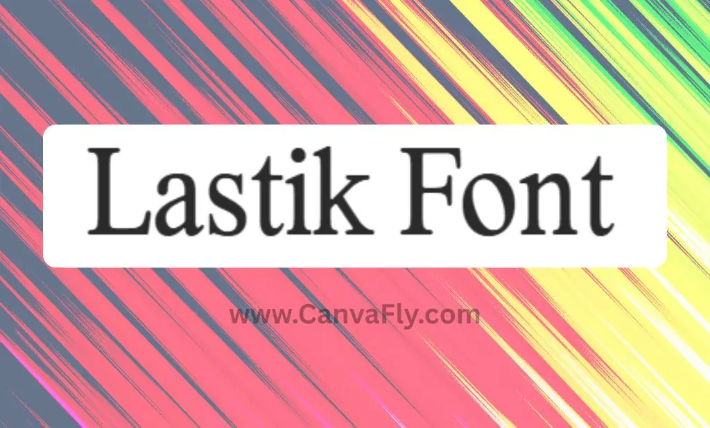
Lastik Font: The Rounded Serif Bringing Nostalgia to Modern Design
In the ever-evolving world of typography, certain fonts stand out for their ability to blend nostalgic charm with contemporary appeal. Lastik Font does exactly that – a rounded serif typeface that’s caught the eye of designers looking for that perfect balance between approachability and sophistication. If you’re considering a typeface that adds personality without sacrificing legibility, you’ll want to keep reading.
Table of Contents
What Makes Lastik Font Special?
Lastik isn’t just another serif font – it’s a versatile rounded serif typeface created by That That Creative that offers five distinct weights from Regular to Bold. The font’s inspiration? Those nostalgic scholastic materials from the late ’90s and early 2000s. That inspiration shines through in every curve, creating a typeface that feels both familiar and fresh.
The font includes a variable option, giving designers pixel-perfect control over weight customization. This flexibility makes Lastik particularly valuable when you need to fine-tune your typography to match exact design requirements.
Key Features of Lastik Font
Lastik goes beyond basic letterforms with several standout features:
- Small caps for adding classic elegance
- Alternate style sets for numbers to create visual interest
- Case-sensitive punctuation for meticulous typography
- Contextual alternatives that enhance text flow
- Support for over 120 languages, making it globally versatile
- 691 glyphs for comprehensive character coverage
The complete Lastik Family Package includes six styles: Variable, Regular, Semi Bold, Bold, Extra Bold, and Black – providing a cohesive toolkit for creating clear visual hierarchies.
Where to Find and Download Lastik Font
If you’re ready to incorporate this versatile typeface into your projects, you have several options:
For those wanting to test the waters, a free version of Lastik Serif Font is available for personal use. This version carries a casual 1970s vibe and classic hand-drawn vintage characteristics – perfect for personal projects and experimentation. For the full commercial license, you’ll need to reach out to the designer, Harbor Bickmore.
The font comes in multiple formats including OTF, TTF, WOFF1, and WOFF2, ensuring compatibility with both desktop design software and web applications. This versatility means Lastik works seamlessly across platforms and projects.
Practical Applications of Lastik Font
Lastik’s versatility makes it suitable for numerous applications across branding and marketing:
For Brand Identity
Lastik shines in logo design, lending a friendly yet distinctive touch that helps brands stand out. Its rounded serifs communicate approachability while maintaining a sense of reliability – an ideal combination for companies wanting to appear trustworthy yet accessible.
In Print and Digital Media
From magazine layouts to website headings, Lastik performs beautifully across mediums. The font maintains excellent readability while adding personality to:
- Print materials
- Packaging design
- Social media graphics
- Website headers
- Editorial content
Cross-Platform Versatility
With compatibility across iOS, Android, Windows, and Linux, Lastik ensures your typography remains consistent regardless of where your audience encounters it. The Webfonts license specifically allows for embedding the font on websites using the @font-face rule.
Lastik Font in the Context of Typography Trends
Lastik embodies several key typography trends that are shaping design in 2024-2025:
Revival of Retro Aesthetics
The font’s inspiration from late ’90s scholastic materials and 1970s casual style taps perfectly into the current trend of retro revival. Designers are increasingly looking backward for inspiration, refining and modernizing historical elements – exactly what Lastik does so well.
Balance of Personality and Readability
Today’s brands seek typefaces that express character without sacrificing function. Lastik’s rounded serifs add distinctive personality while maintaining excellent readability – addressing the pushback against overly simplified sans serifs that lack character.
Versatility Across Applications
With the increasing demand for consistent branding across multiple touchpoints, Lastik’s range of weights and formats makes it an ideal choice for brands seeking cohesion between print and digital applications.
Why Rounded Serif Fonts Like Lastik Are Gaining Popularity
The psychology behind rounded serif fonts explains their growing appeal:
Approachability Meets Tradition
Rounded serifs like Lastik strike a perfect balance – the serifs convey tradition and reliability, while the rounded forms project friendliness and approachability. This combination allows brands to appear established without seeming stuffy or unapproachable.
Emotional Response
The soft, curved edges of rounded serifs evoke positive emotional responses. They feel warmer and more inviting than sharp-edged alternatives, creating an immediate sense of comfort for viewers.
Nostalgic Connection
Fonts like Lastik tap into collective nostalgia for certain time periods – in this case, the late ’90s and early 2000s scholastic materials and 1970s casual styles. This nostalgic quality creates an immediate emotional connection with audiences who remember these eras fondly.
Pairing Lastik With Other Fonts
Creating a harmonious typography system requires thoughtful pairing. For Lastik, consider these approaches:
Complementary Sans-Serif
Pairing Lastik with a clean sans-serif like SF Pro creates a pleasing contrast while maintaining visual harmony. Use Lastik for headings and the sans-serif for body text to create clear hierarchy.
Classic Serif Companions
For a more traditional approach, Lastik works well with classic serifs like Adobe Garamond. The contrast between Lastik’s rounded forms and the sharper serifs of traditional typefaces creates visual interest.
Maintaining Hierarchy
When using Lastik as your primary brand font, establish a clear hierarchy by using different weights for headings, subheadings, and accent text. The font’s range of weights from Regular to Black provides plenty of contrast options within the same typeface family.
Strategic Brand Positioning With Lastik Font
Choosing Lastik for your brand typography sends specific signals to your audience:
For Brands Seeking Approachability
Lastik’s rounded serifs communicate friendliness and accessibility, making it ideal for brands wanting to appear welcoming rather than formal or intimidating. This quality makes it particularly suitable for:
- Consumer-facing brands
- Educational organizations
- Community-focused businesses
- Lifestyle and wellness companies
For Brands With a Nostalgic Element
The font’s retro influences make it perfect for brands that want to evoke a sense of nostalgia while maintaining contemporary relevance. This could work particularly well for:
- Craft food and beverage companies
- Independent bookstores and coffee shops
- Vintage-inspired clothing and accessories
- Brands targeting millennials who grew up in the late ’90s/early 2000s
For Brands Balancing Professionalism and Warmth
Unlike purely playful fonts or strictly corporate typefaces, Lastik occupies a sweet spot between professionalism and warmth. This balance makes it suitable for:
- Creative agencies
- Small professional services firms
- Tech companies with a human-centered approach
- Healthcare providers aiming to appear trustworthy yet caring
Ensuring Consistent Application of Lastik Font
Consistency in typography is crucial for building brand recognition. When implementing Lastik across your brand materials:
- Develop clear guidelines for which weights to use in different contexts
- Define specific size ranges that maintain the font’s legibility
- Document proper spacing (line height, kerning, tracking) for optimal readability
- Specify color applications that ensure sufficient contrast
- Create templates for common applications to ensure consistency
Conclusion: Is Lastik Font Right for Your Brand?
Lastik Font offers a distinctive blend of nostalgic charm and contemporary versatility that makes it worthy of consideration for brands seeking to stand out. Its rounded serif character communicates approachability and reliability – qualities that resonate strongly with today’s consumers seeking authentic connections with brands.
Whether you’re refreshing an existing brand or building one from scratch, Lastik provides the technical versatility and emotional resonance to create meaningful impressions. Its balance of personality and function makes it particularly valuable in a design landscape where differentiation is increasingly challenging.
Ready to give your brand a friendly yet distinctive voice? Consider downloading Lastik Font and experimenting with its versatile character in your next design project.