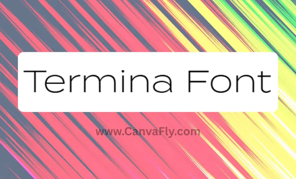
Termina Font: The Wide Geometric Typeface That’s Redefining Modern Design
You know that feeling when you spot a font that just works? That’s the Termina font for you. This isn’t your typical geometric sans serif – the Termina font is the typeface equivalent of finding the perfect leather jacket. Wide, confident, and impossibly versatile, the Termina font has been quietly revolutionizing how brands think about typography since 2015.
While everyone else was playing it safe with narrow, condensed fonts, designer Mattox Shuler took a different route. He created the Termina font – something that commands attention without shouting – think James Bond ordering a martini, not a sports commentator calling plays.
Table of Contents
What Makes Termina Font Special?
The font Termina breaks the mold with its generous proportions and sky-high x-height. Where most geometric fonts feel clinical, the Termina font brings warmth to the party. It’s like the difference between a sterile conference room and your friend’s well-designed apartment – both functional, but one actually makes you want to stick around.
Born from Mattox Shuler’s deep dive into Hermann Zehnpfundt’s early 1900s Industria specimens, the Termina font represents a modern interpretation rather than a straight revival. Fort Foundry released this gem with nine weight variations, from whisper-thin to bold-as-brass Heavy.
The technical specs? We’re talking 743 glyphs packed with OpenType features – Stylistic Alternates, Small Capitals, Old Style Figures, and Case-Sensitive Forms. It’s the Swiss Army knife of typography, ready for whatever design challenge you throw at it.
Why Wide Geometric Fonts Are Having a Moment
2025’s design landscape is all about making statements without being obnoxious. Wide geometric fonts like the Termina font hit that sweet spot between “look at me” and “trust me.” They’re the typography equivalent of confidence without cockiness.
The trend toward approachable typefaces reflects our collective craving for brands that feel human. Narrow, condensed fonts can feel uptight – like someone who corrects your grammar at parties. Wide fonts? They’re the ones buying the next round.
This shift aligns with retro-inspired typography making a comeback. Fonts from the 70s, 80s, and early 2000s are reemerging, and the Termina font bridges that gap perfectly. It’s modern enough for a tech startup but carries subtle mid-century vibes that resonate with audiences who appreciate both heritage and innovation.
Termina Font Download: Where to Get It
Ready to add the Termina font to your toolkit? You’ve got options. The easiest route for most designers is through Adobe Fonts if you’re rocking a Creative Cloud subscription. Zero extra cost, unlimited pageviews for web use – it’s basically typography on tap.
For those seeking a Termina font download outside the Adobe ecosystem, several foundries offer licensing options. YouWorkForThem and other professional type retailers provide various licensing tiers depending on your needs.
Budget-conscious? There are free alternatives floating around, but here’s the thing – premium fonts like the Termina font come with deeper character sets, professional support, and licensing clarity. It’s the difference between a knockoff and the real deal.
Typography Trends: The Termina Font Effect
The success of the Termina font has sparked a mini-revolution in wide geometric fonts. Suddenly, everyone wants that confident, spacious aesthetic. Similar typefaces like Idlewild, Geometrica, Equip, and Gerbera are gaining traction, each offering their own take on the wide geometric formula.
| Font Name | Key Characteristics | Best Use Cases |
|---|---|---|
| Termina | Wide letterforms, high x-height | Branding, web headers, mobile interfaces |
| Idlewild | Geometric precision, multiple weights | Corporate identity, signage |
| Geometrica | Clean construction, modern feel | Tech brands, minimal designs |
| Neue Montreal | Contemporary sans, geometric design | Editorial, lifestyle brands |
This proliferation creates opportunities and challenges. More options mean better chances of finding the perfect fit, but it also means working harder to stand out. It’s like everyone discovering the same hidden cocktail bar – suddenly it’s not so hidden anymore.
Brand Positioning Through Strategic Typography
Here’s where things get interesting. Typography impacts brand perception before people consciously process other brand elements. The Termina font’s wide geometric characteristics position brands as modern, confident, and approachable – the holy trinity of contemporary branding.
Think about it: a tech startup using the Termina font signals innovation without intimidation. A lifestyle brand leverages its approachable width to feel inclusive rather than exclusive. The font becomes a silent ambassador, communicating brand values through every letterform.
The relationship between typography and brand personality becomes crucial in competitive positioning. Termina’s versatility allows brands to adapt their positioning across contexts while maintaining visual consistency. It’s like having a chameleon that stays recognizably you.
Marketing Advantages of Using Termina
Beyond aesthetics, Termina delivers practical marketing advantages. Its high x-height and wide letterforms ensure excellent readability across devices – from desktop monitors to smartphone screens. In our mobile-first world, that’s not just nice to have; it’s essential.
The font’s extensive language support covering Latin and numerous specialized characters enables brands to maintain consistent visual identity across global markets. This becomes increasingly valuable as companies expand internationally, allowing typography to serve as a unifying brand element across diverse linguistic contexts.
Professional font licensing through Adobe Fonts or direct foundry purchases provides legal security and ongoing support – crucial factors for professional brand implementation. It’s the difference between building on solid ground versus quicksand.
Font Pairing: Making Termina Work Harder
Termina plays well with others, but choosing the right supporting cast matters. For body text, consider pairing it with more neutral geometric options or serif fonts that provide contrast while maintaining cohesion. The goal isn’t matchy-matchy – it’s complementary confidence.
Winning combinations:
- Termina + Avenir: Modern geometric harmony
- Termina + Minion Pro: Contemporary meets classic
- Termina + Source Sans Pro: Clean, functional efficiency
The key is establishing clear typographic hierarchy. Use Termina for headers and key brand moments, then step back with supporting fonts that enhance rather than compete. It’s like being the lead singer while having a killer backup band.
Implementation Strategy: Getting Termina Right
Rolling out a new font isn’t just about swapping files. Successful implementation requires developing font policies that specify usage guidelines, weight selections, sizing standards, and approved pairings. Think of it as the user manual for your brand’s voice.
Start with defining brand characteristics and target audience preferences. Does Termina’s modern, approachable vibe align with your desired brand perception? If you’re positioning as cutting-edge and accessible, you’re in the right neighborhood.
Test combinations across different applications – business cards, websites, mobile apps, signage. Termina’s technical capabilities shine across digital platforms, but ensure it works in your specific context. Sometimes fonts look great in theory but fall flat in practice.
The Competitive Landscape
The proliferation of wide geometric alternatives creates both opportunities and challenges. While more options exist than ever, maintaining uniqueness requires sophisticated understanding of subtle differences between similar fonts.
Contemporary options like OPTITomaso-Extended, Heading Pro Wide Trial Book, and LT Amber Wide Extra-expanded Regular demonstrate continued market demand for this aesthetic approach. Each brings nuanced characteristics that might better suit specific brand personalities or technical requirements.
Understanding these alternatives helps position Termina strategically. It’s not about finding the “best” font – it’s about finding the right font for your specific brand story and audience needs.
Future-Proofing Your Typography Choice
Typography trends evolve, but certain characteristics endure. Termina’s foundation in geometric principles and focus on legibility suggest longevity beyond current trend cycles. It’s built on solid design fundamentals rather than fleeting aesthetic preferences.
The continued popularity of geometric sans serifs reflects broader cultural shifts toward clean, minimalist design approaches that prioritize clarity and functionality. This aligns with consumer preferences for brands that appear modern, trustworthy, and accessible.
Regular policy reviews ensure typography remains aligned with evolving brand needs and market trends. What works today might need adjustment tomorrow, but starting with a strong foundation like Termina provides flexibility for future adaptations.
Making the Call
Termina font represents more than a typography choice – it’s a strategic brand decision that impacts perception, usability, and competitive positioning. Its distinctive wide letterforms, high legibility, and modern geometric construction position it as valuable for brands aiming to convey innovation, accessibility, and confidence.
The proliferation of similar fonts creates complexity, but also opportunity. Success lies not in following trends blindly, but in understanding how typography choices support broader brand strategy. Termina offers a compelling option for brands seeking to stand out through sophisticated, approachable design.
Whether you’re launching a startup, refreshing an established brand, or simply seeking typography that performs across platforms, Termina deserves consideration. It’s not just about looking good – it’s about communicating effectively with audiences who increasingly value both form and function.
The font landscape will continue evolving, but geometric wide fonts like Termina have established themselves as more than fleeting trends. They represent a mature approach to typography that balances aesthetic appeal with practical performance. In a world where first impressions matter more than ever, that’s exactly the kind of wingman you want in your corner.