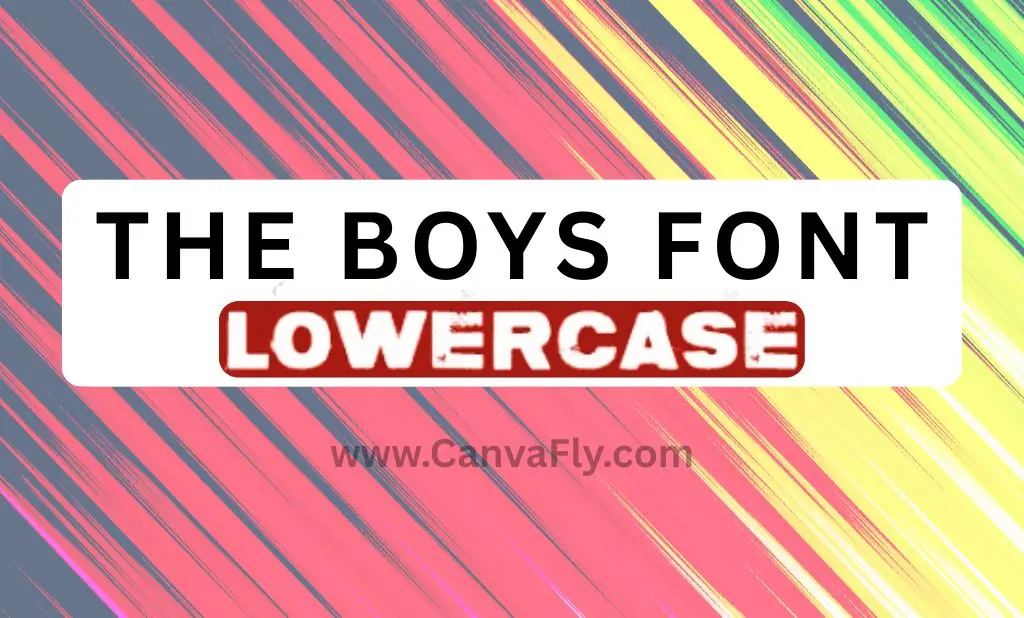
The Boys Font: Typography That Packs a Superhero Punch
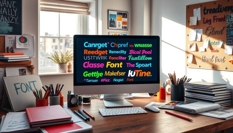
Ever noticed how the bold, gritty lettering in The Boys logo instantly communicates strength and rebellion? That’s no accident. Typography speaks volumes before you read a single word, and The Boys font is a masterclass in visual communication through letterforms.
Whether you’re a designer looking to capture that same raw energy or just curious about the typographic choices behind your favorite anti-hero show, this guide breaks down everything you need to know about The Boys font—and how similar typefaces can inject some superhero-subverting attitude into your own projects.
Table of Contents
What Makes The Boys Font So Distinctive?
The Boys font wasn’t picked from a standard library—it was custom-designed specifically to embody the show’s themes of power, corruption, and rebellion against corporate superhero culture. While you can’t download the exact font, understanding its key characteristics will help you find worthy alternatives.
The typeface features:
- Heavy weight: Thick, bold strokes that command attention
- Condensed spacing: Letters packed tight for maximum visual impact
- Sharp, angular terminals: Edges that feel dangerous and unpredictable
- Minimalist structure: No serifs or decorative elements—just raw power
- Subtle texture: A slightly distressed finish that adds gritty authenticity
This combination creates a visual presence that’s impossible to ignore—perfect for a show that takes an unflinching look at superhero mythology.
Top Alternatives to The Boys Font for 2025
While the original font remains proprietary, several alternatives capture the same rebellious spirit:
Charlie Don’t Surf: The Rebel’s Choice
Charlie Don’t Surf is widely considered the closest match to The Boys font. Named after The Clash’s 1980 anti-establishment anthem, this typeface carries cultural significance beyond its visual impact. Its rugged, sans-serif design with irregular edges makes it perfect for projects that need to communicate strength with a hint of anarchic energy.
The font’s popularity in fan art and grassroots campaigns demonstrates its ability to connect with audiences seeking authenticity and counter-cultural appeal.
Grunge and Distressed Options
For projects needing that extra edge, these distressed alternatives deliver:
- Grayson Rough: Features textured edges that simulate wear and tear
- Triump Rough: Offers multiple distress levels from subtle to extreme
- Broken Drive: Incorporates uneven baselines and ink bleeds for handcrafted imperfection
These grunge-inspired fonts allow designers to toggle between subtle texture and high-impact abrasion, making them versatile choices for brands wanting to fine-tune their messaging.
Clean Yet Bold Alternatives
Not every project calls for maximum distress. These options maintain The Boys’ boldness while adopting cleaner geometries:
- Bebas Neue: Uses uniform stroke widths and open counters for enhanced readability
- Ugly Alligator: Balances edginess with accessibility for broader appeal
Creating Your Own The Boys-Style Designs
Ready to put these fonts to work? Here’s how to effectively incorporate The Boys font aesthetic into your projects:
Font Generator Options for The Boys Style
While no generator perfectly replicates the custom typeface, several online tools can help you create The Boys-inspired text for social media, fan art, or personal projects. Many font generator sites offer distressed, bold typefaces that capture the spirit of the original.
For professional projects, however, purchasing a licensed alternative remains the better option.
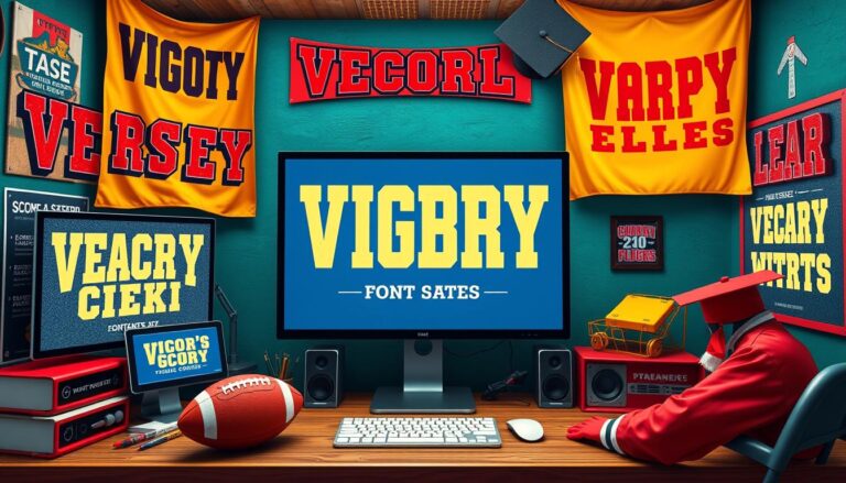
Strategic Applications for Different Industries
| Industry | Font Suggestion | Strategic Benefit |
|---|---|---|
| Gaming | Charlie Don’t Surf | Communicates rebellion and intensity |
| Fitness | Triump Rough | Conveys grit and determination |
| Streetwear | Bebas Neue | Balances urban edge with readability |
| Music | Broken Drive | Evokes DIY, authentic aesthetic |
| Corporate Rebel | Grayson Rough | Disrupts expectations while maintaining professionalism |
Typography Psychology: Why The Boys Font Works
Typography isn’t just about aesthetics—it’s about psychology. The Boys font works because it aligns perfectly with the show’s positioning:
Emotional Impact
The jagged edges and compact structure of fonts like The Boys’ create visceral, emotional responses. Research shows that bold, condensed typefaces with irregular textures trigger associations with grassroots movements and artistic subcultures.
Brands looking to forge deeper emotional connections with audiences—particularly in music, gaming, or activism—can harness these associations through thoughtful font selection.
Standing Out in Crowded Markets
In entertainment, apparel, and other visually saturated industries, distinctive typography cuts through the noise. The compact, aggressive lines of The Boys font ensure memorability and brand recall.
Consider how a beverage company using a similar typeface on packaging could stand out on crowded shelves by evoking a “rebel” persona—instantly communicating what makes their product different.
The Boys Font in 2025: Typography Trends
As we move through 2025, several typography trends are emerging that align with The Boys aesthetic:
Hyper-Customization Through Variable Fonts
Variable font technology now enables real-time adjustment of weight, width, and texture. Brands can use a single Boys-inspired variable font to seamlessly adapt typography from sleek mobile interfaces to gritty billboards, maintaining brand consistency across platforms.
Sustainable and Handcrafted Aesthetics
As consumers increasingly prioritize sustainability, fonts mimicking hand-drawn imperfections (like Broken Drive) are gaining traction. These typefaces signal artisanal quality and ethical production—values that resonate strongly with today’s conscious consumers.
Cultural Responsiveness
The most forward-thinking brands are adapting typography to reflect evolving social movements. Typefaces blending The Boys’ boldness with inclusive design principles (like dyslexia-friendly spacing) resonate with socially conscious audiences without sacrificing impact.
The Do’s and Don’ts of Using Bold, Distressed Fonts
Do’s:
- Use for headlines and attention-grabbing elements
- Pair with cleaner fonts for body text
- Ensure cross-platform readability
- Consider your audience’s cultural context
Don’ts:
- Overuse to the point of reducing readability
- Apply to lengthy body text
- Ignore licensing requirements
- Choose based solely on aesthetic without considering brand alignment
Making The Boys Font Work for Your Brand
The power of The Boys font lies in its ability to instantly communicate rebellion, strength, and authenticity. By understanding the principles behind its design, you can strategically select typefaces that deliver similar impact for your own projects.
Whether you’re designing for a streetwear label, a fitness app, or an indie game, the right typography can differentiate your brand in crowded markets and forge meaningful connections with your audience.
The lesson from The Boys is clear: typography isn’t just about readability—it’s about identity. Choose fonts that don’t just speak your message, but shout it with the same uncompromising attitude that makes The Boys stand out in a world saturated with superhero content.
Ready to bring some of that rebellious energy to your next design project? The right font might just be your most powerful tool.