Y2K Fonts: Your Brand’s Secret Weapon for Standing Out in 2025
Remember when everyone thought the world would end because computers couldn’t handle the year 2000? Well, plot twist – those y2k fonts from that era are now your ticket to making your brand unforgettable. While everyone else is still playing it safe with minimalist sans-serif, you could be the brand that actually makes people stop scrolling.
Here’s the thing about Y2K typography – it’s not just about nostalgia anymore. It’s become a strategic power move for brands who want to cut through the noise and connect with audiences craving something real. Think of it as your design cheat code in a world where everything looks the same.
Table of Contents
What Makes Y2K Fonts So Special?
Y2k fonts didn’t just appear out of nowhere. They emerged from a unique moment in design history when digital creativity was exploding and everyone thought we were heading straight into the future. The early 2000s were wild – personal computers were becoming mainstream, the internet was this exciting new frontier, and designers had unprecedented freedom to experiment.
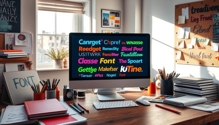
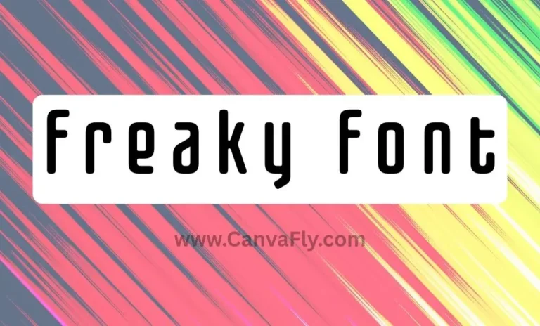
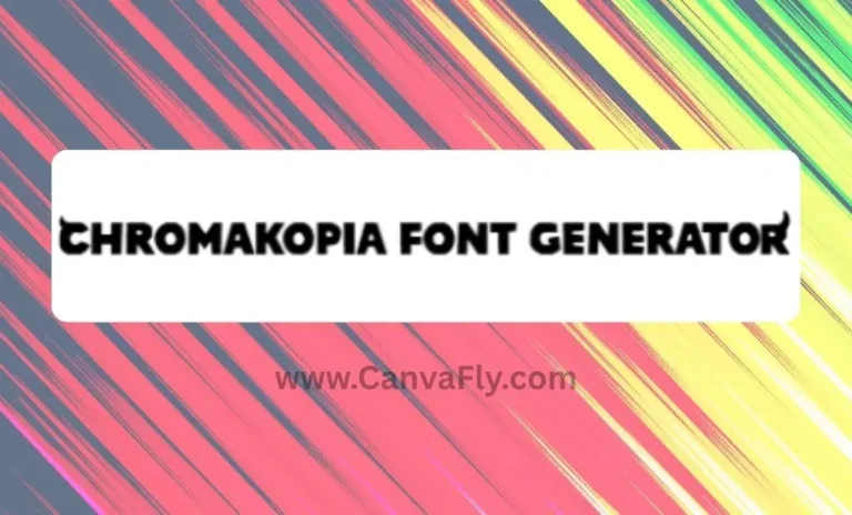
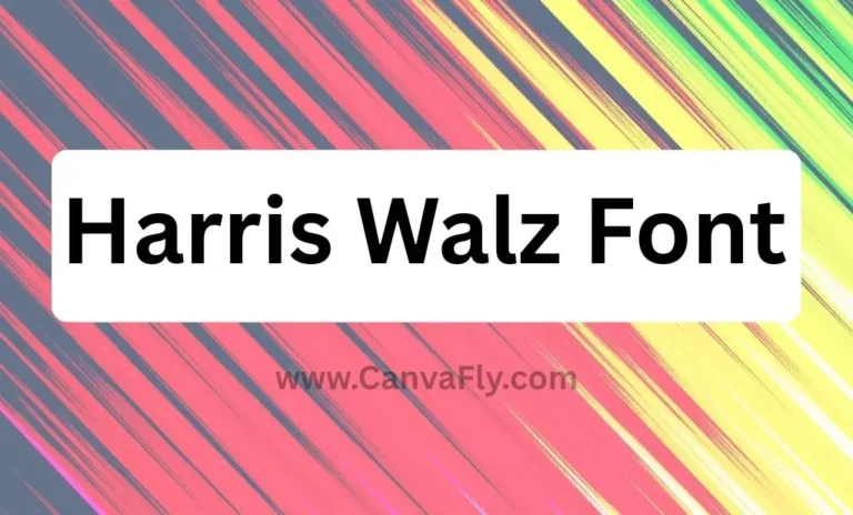
These fonts capture that optimistic, tech-forward energy perfectly. We’re talking about bold, playful typography that embraces 3D effects, gradients, and those iconic pixelated structures that remind you of old computer displays. It’s like someone took the future as imagined in 1999 and turned it into a font family.
Y2k fonts typically feature:
- Bold, eye-catching designs that demand attention
- Pixelated, block-like structures reminiscent of early digital displays
- Futuristic aesthetics mixing geometric shapes with abstract patterns
- Playful distortions and experimental letterforms
- That perfect blend of retro and forward-thinking vibes
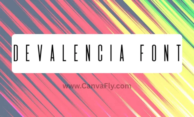
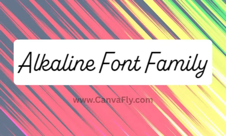
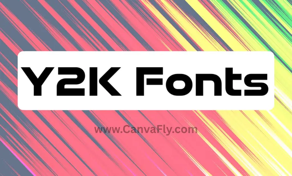
Contemporary y2k fonts have evolved beyond simple throwbacks. You’ve got everything from distorted, melted-looking designs that feel like digital art to jagged-edged fonts with serious rock-and-roll energy. Popular examples include BOTCH with its creative twists and Cinema with those nostalgic pixelated structures.
Why Your Brain Loves Y2K Fonts (And Your Customers Will Too)
Here’s where it gets interesting – the y2k fonts revival isn’t just about looking cool. It’s tapping into some serious psychological triggers that smart marketers are using to their advantage.
Nostalgia marketing is having a moment, and for good reason. Studies show that reminiscing about previous decades makes consumers feel happier and more connected to brands. It triggers comfort, familiarity, and trust – exactly what you want your audience feeling about your brand.
But here’s the kicker: Gen Z and Millennials are driving this y2k fonts trend hard. Gen Z’s obsession with vintage aesthetics makes them perfect targets for brands using Y2K-inspired design. They’re craving authenticity in an increasingly digital world, and Y2K aesthetics have become their vehicle for self-expression.
Think about it – these consumers grew up during the digital revolution. Y2k fonts don’t just look cool to them; they represent a time when technology felt limitless and exciting, not invasive and overwhelming.
How Smart Brands Are Using Y2K Fonts to Win
The brands winning with y2k fonts aren’t just slapping them on everything and calling it a day. They’re being strategic about it.
Fashion brands like Champion have embraced Y2K-inspired campaigns that use bold typography to cut through crowded marketplaces. Tech companies are particularly drawn to pixelated typefaces that bring back memories of early video games and computer graphics – perfect for startups wanting to add nostalgic twists to their branding.
Social media is where y2k fonts really shine. Brands are creating nostalgic content from throwback playlists to memes that incorporate distinctive typography. The boldness works perfectly for capturing attention in increasingly competitive digital environments.
| Industry | Y2K Font Application | Strategic Benefit |
|---|---|---|
| Fashion | Campaign headlines and social media | Cuts through marketplace noise |
| Tech/Gaming | Brand identity and UI elements | Nostalgic connection to early gaming |
| Entertainment | Album covers and promotional materials | Appeals to millennial/Gen Z nostalgia |
| Social Media | Content creation and memes | High engagement and shareability |
The secret sauce? These brands are using y2k fonts to tap into cultural touchstones, creating shared experiences that resonate on deeper emotional levels.
Stand Out From the Minimalist Crowd
While everyone else is still obsessing over clean, minimal typography, y2k fonts offer you a massive competitive advantage. The design landscape has been dominated by minimalist aesthetics for over a decade – which means there’s a huge opportunity for brands willing to be bold.
This isn’t about being different for the sake of it. Y2k fonts let you communicate multiple brand attributes simultaneously. You can appear innovative and forward-thinking while also feeling comfortable and familiar. It’s positioning magic – appealing to both rational and emotional decision-making processes.
The fonts work exceptionally well for youth-focused brands, tech companies, entertainment properties, and any organization wanting to convey energy, creativity, and cultural relevance. Market research shows they’re particularly effective for brands targeting specific demographic segments who value authenticity and creative expression.
Want to know if y2k fonts are right for your brand? Ask yourself: Are you trying to reach audiences who crave authenticity over perfection? Do you want to signal that your brand takes creative risks? Are you competing in a space where everyone looks the same? If you’re nodding yes, you might have found your secret weapon.
Choosing the Right Y2K Fonts for Your Brand
Not all y2k fonts are created equal, and picking the wrong one can make your brand look like it’s trying too hard. The key is matching font personality to your brand’s core values and communication goals.
For cutting-edge tech and innovation vibes, fonts like Neo-Syber or Saturas offer futuristic aesthetics that work perfectly for tech-related projects or space-themed concepts. If you’re in entertainment, gaming, or youth culture, more playful options like Rocket Pop or fonts inspired by pop culture properties might be your jam.
Corporate brands don’t have to miss out either. You can opt for cleaner, more contemporary interpretations that maintain professional credibility while incorporating trendy elements. It’s about finding that sweet spot between authenticity and appropriateness for your audience.
Implementation Pro Tips:
For headlines and titles where visual impact trumps extended readability, y2k fonts are perfect. They work exceptionally well for promotional materials, social media graphics, and any touchpoint where you want immediate attention.
But remember – authenticity is everything. Gen Z and Millennials can spot forced nostalgia from a mile away. Your y2k fonts choice needs to feel genuine to your brand’s personality, not like you’re chasing trends.
Consider how the typography integrates with your existing brand elements. Colors, imagery, overall design systems – everything should work together to create cohesive experiences that reinforce your brand positioning across all touchpoints.
Download Proxima Nova Font and Other Y2K Alternatives
While proxima nova font download searches are popular for good reason (it’s clean and versatile), y2k fonts offer something Proxima Nova can’t – that bold, attention-grabbing personality that makes people stop and look.
If you’re used to safer choices like when you download proxima nova font, making the jump to Y2K typography might feel risky. But that’s exactly why it works. In a world where everyone’s playing it safe, being bold is your competitive edge.
The beauty of y2k fonts is their versatility. You can use them as statement pieces in headlines while keeping body text in more readable fonts. Think of them as the exclamation point in your visual vocabulary – use them strategically, and they’ll amplify your message without overwhelming it.
The Future of Y2K Typography
Here’s what’s coming next for y2k fonts: we’re moving beyond simple replication of early 2000s aesthetics. Typography trends indicate that Y2K fonts will remain influential throughout 2025, but with evolving interpretations that blend nostalgic elements with contemporary design sensibilities.
Emerging variations include nouveau futurism – more fluid, experimental typefaces that blend natural forms with futuristic elements. This evolution means brands can adopt Y2K-inspired typography while maintaining contemporary relevance and avoiding dated appearances.
The trend isn’t slowing down either. Current market indicators suggest that y2k fonts will continue trending through 2025, providing ongoing opportunities for strategic implementation across various industry sectors.
Smart brands are already thinking about how y2k fonts can evolve within their design systems over time, potentially transitioning from pure nostalgia to hybrid approaches that maintain relevance as cultural preferences shift.
Your Y2K Font Action Plan
Ready to join the y2k fonts revolution? Start with thorough audience research to ensure authentic fit. Gen Z and Millennials are savvy – they’ll call out inauthentic attempts at nostalgia faster than you can say “millennium bug.”
Develop clear guidelines for appropriate usage contexts. Y2k fonts work best for headlines, social media graphics, and promotional materials where visual impact is prioritized. Create implementation timelines that allow for strategic market entry rather than reactive trend-following.
Most importantly, consider how y2k fonts integrate with your broader brand evolution strategy. Make sure your typographic choices support long-term brand objectives, not just short-term trend capitalization.
The brands that understand this distinction and implement y2k fonts as part of broader strategic initiatives will find these fonts to be powerful tools for building memorable, differentiated brand experiences that drive both immediate engagement and long-term loyalty.
Bottom Line
Y2k fonts represent more than just a design trend – they’re a strategic opportunity for brands willing to break free from minimalist monotony and connect with audiences craving authenticity and emotional resonance.
The revival of these bold, futuristic typefaces reflects broader consumer desires for alternatives to the design dominance that’s characterized the past decade. For designers, marketers, and brand owners, y2k fonts offer tools for creating distinctive visual identities that resonate with key demographic segments while providing clear competitive differentiation.
Success with y2k fonts isn’t about jumping on trends – it’s about authentic integration that supports broader brand objectives while leveraging the emotional and cultural power of nostalgia marketing. As the trend continues evolving through 2025 and beyond, brands that thoughtfully incorporate Y2K typography into comprehensive design strategies will be best positioned to capture the benefits of this cultural renaissance.
The future belongs to brands brave enough to stand out. Y2k fonts might just be your ticket to getting noticed in a world that’s forgotten how to be bold.